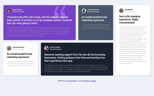
Testimonial Grid Section

Solution retrospective
What I’m most proud of: I’m really proud of how the testimonial grid section turned out, particularly the responsive design aspect. I enjoyed seeing the layout adjust seamlessly across various screen sizes while maintaining its aesthetic and usability. Using CSS Grid was also a major highlight since it allowed me to organize the content flexibly. Another thing I’m proud of is the clean, minimalistic design that brings focus to the testimonials without overwhelming users.
What I would do differently next time: If I were to approach this project again, I would dive deeper into advanced animations and transitions to make the user experience more interactive and visually engaging. Additionally, I would consider implementing JavaScript to dynamically fetch testimonial data, making the component more adaptable for real-world applications.
Overall, I’m pleased with the result, but there’s always room for enhancing the user experience with more interactivity and modern design techniques.
What challenges did you encounter, and how did you overcome them?Challenges I encountered: One of the main challenges I faced was ensuring the testimonial grid remained responsive across different screen sizes without breaking the layout. Balancing the aesthetics while maintaining functionality across mobile, tablet, and desktop views took some trial and error. Another challenge was effectively positioning background images and elements like avatars while keeping the design clean and aligned.
How I overcame them: To overcome the responsiveness issue, I experimented with various CSS Grid and Flexbox techniques, which allowed me to define grid areas and manage column spans more efficiently. For background images and avatars, I had to fine-tune positioning with absolute values and z-index properties, which ensured that all elements stayed in their respective places. I also utilized media queries to create more customized breakpoints for specific device sizes, ensuring a smooth user experience.
What specific areas of your project would you like help with?Areas I would like help with:
Advanced Animations: I’d love to incorporate more dynamic transitions or animations for the testimonials. Any suggestions or resources for creating smooth, subtle animations using CSS or JavaScript would be appreciated.
Code Optimization: I am open to feedback on how I can further optimize my CSS, especially when it comes to managing repetitive styles or improving responsiveness for more complex layouts.
JavaScript for Dynamic Content: I’m thinking of making this testimonial section more dynamic by fetching content from an API or JSON file. If anyone has tips on the best practices for implementing this or how I can make the component more scalable, I’d love to hear them!
Any advice on these areas or ways I can improve my overall approach would be incredibly valuable!
Please log in to post a comment
Log in with GitHubCommunity feedback
No feedback yet. Be the first to give feedback on TURLAPATI MANOHAR's solution.
Join our Discord community
Join thousands of Frontend Mentor community members taking the challenges, sharing resources, helping each other, and chatting about all things front-end!
Join our Discord