

Design comparison
SolutionDesign

Solution retrospective
What are you most proud of, and what would you do differently next time?
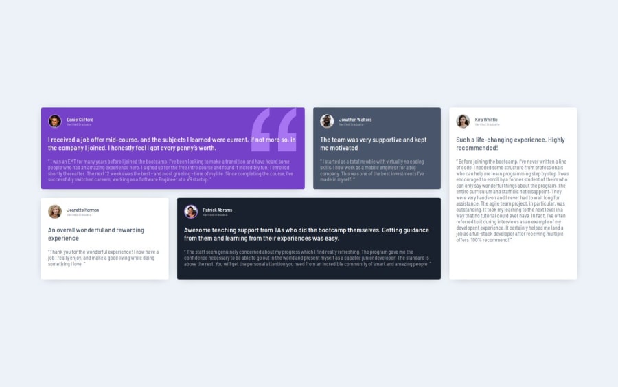
Most proud of using grid seamlessly and combining it with flex in the card elements to create an easy to build layout.
What challenges did you encounter, and how did you overcome them?The biggest challenge I had, was that I started building before having a firm mental model of how to organize classes and the layouts. As a result, I settled for less-mantainable code that I knew was of lower quality than if I had been more thoughtful before jumping right into the code. Still happy with how it turned out.
What specific areas of your project would you like help with?How would you recommend doing classes differently?
I think I would have had 2 card classes, one dark card, and one light card.
Community feedback
Please log in to post a comment
Log in with GitHubJoin our Discord community
Join thousands of Frontend Mentor community members taking the challenges, sharing resources, helping each other, and chatting about all things front-end!
Join our Discord