Design comparison
Solution retrospective
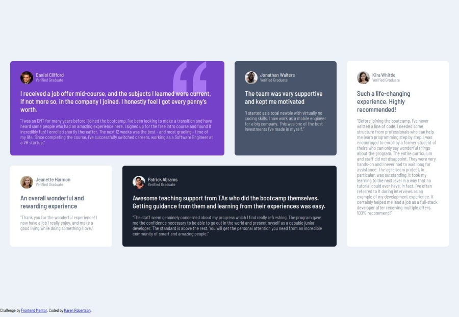
The solution was a real push to develop CSS Grid. I have done it in the past but as I moved to backend work and development, my knowledge was hazy and the main reason why I am following these learning paths and designs to have good reference templates for future web applications.
Now that I have this grid template, I will definitely refer back and experiment with other bento style layouts.
What challenges did you encounter, and how did you overcome them?This challenge definitely pushed my knowledge of grid and positioning of the testimonial cards.
In the mobile view, it was simple to use flexbox and flex-direction: column for the initial card layout.
However the issue came when wanted to use grid. I have previously used the site Layoutit! to design my grid designs.
At first I thought the horizontal cards would be contained within their own div with the fifth card being vertical on the end.
This took a long time to correct as doing so created various width and height card sizes. It wasn't until I stumbled on a css video about grid that finally helped and I was able to refactor my code removing the unnecessary parent child container elements and more seamless design.
As I completed the challenge without using figma files, this is as close I could get.
I am also building on my css custom properties, I mainly use them for the colourways, as it can become tedious typing out hsl colours for each html element.
Maybe with the next I will look into SASS and Tailwind.
What specific areas of your project would you like help with?In terms of styling, what I have struggled with is box shadowing. It may be due to my computer set up, but sometimes it hard to see from the design brief photos if you don't have the Figma files yet.
As this challenge more focused on the ability for page to be responsive, it may be seen as minor detail but in the long run for web design it would be good to know how to gauge it on photos.
Community feedback
Please log in to post a comment
Log in with GitHubJoin our Discord community
Join thousands of Frontend Mentor community members taking the challenges, sharing resources, helping each other, and chatting about all things front-end!
Join our Discord
