Not Found
Not Found
Not Found
Not Found
Not Found
Not Found
Not Found
Not Found
Not Found
Not Found
Not Found
Not Found
Not Found
Not Found
Not Found
Not Found
Not Found
Not Found
Not Found
Not Found

Submitted

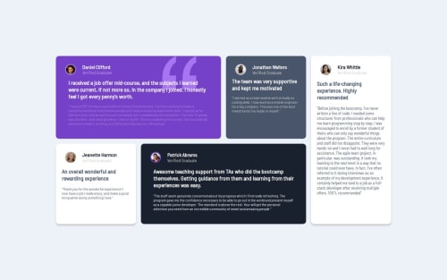
Testimonial Grid Section

JmsLpz 80

@JmsLpz

Desktop design screenshot for the Testimonials grid section coding challenge

This is a solution for...

  • HTML
  • CSS
2junior
View challenge

Design comparison


SolutionDesign

Solution retrospective


What are you most proud of, and what would you do differently next time?

I am proud that I have learned new things about how to use a grid.

What challenges did you encounter, and how did you overcome them?

The most challenging part I encountered while creating this project was the placement of boxes.

What specific areas of your project would you like help with?

Anything that can help me to improve.

Community feedback

P
Hexerse 460

@Hexerse

Posted

Your code looks great. I think there are ways it can be better though instead of using flex box you can use grid. Which makes the alignment part SO MUCH EASIER ! And simpler, it will take less code. This is how my container code looks like !

.container{ display: grid; gap: 2.5rem; font-family: var(--ff-barlow); width: 90rem; margin: 5rem;

min-height: 50rem;
max-height: 100rem;

grid-template-columns: repeat(4,1fr);
grid-template-rows: 1fr 1fr;
grid-template-areas: 
"card-daniel card-daniel card-jonathan card-kira"
"card-jeanette card-patrick card-patrick card-kira";

}

grid template areas allow me to layout my code in the grid the way I want it to look ! All I needed to do for media is to change the container abit and the layout abit ! It takes less code.

0

Please log in to post a comment

Log in with GitHub
Discord logo

Join our Discord community

Join thousands of Frontend Mentor community members taking the challenges, sharing resources, helping each other, and chatting about all things front-end!

Join our Discord