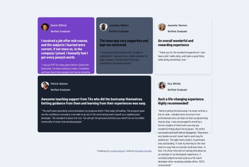
Design comparison
SolutionDesign
Solution retrospective
What are you most proud of, and what would you do differently next time?
Learning how to make grid layout and using grid area
Community feedback
- @yaywonahPosted 4 months ago
CSS
All of my suggestions follow the order in your CSS file.
design/typography
- I'd put a
margin: 0
on the.word p
selector in order to get rid of the space between the name and verified graduate. That way, it looks closer to the design where both are on top of each other instead of having space in between. - remove the
padding-top: 12px
andpadding-top: 15px
on yourimg
selector so that the profile pic is a circle instead of a half oval in mobile and desktop layout. Instead of using padding-top, add aalign-items: center
in your.name
to align both divs. - there is a missing
;
after--white: hsl(0, 0%, 100%)
. adding the semi-colon will make your card_3 and card_5 have white backgrounds - the justify-content and justify-item properties has no effect on divs with display: inline-block, which you added in your
.container
in your@media (max-width: 1000px)
media query.
/css grid/
- I recommend this CSS Grid tutorial by Kevin Powell. He shows how to use CSS grid using this project as an example.
- you can also look at his code to see where to add the quotation mark svg graphic into your design.
Marked as helpful0 - I'd put a
- @yemmightoPosted 4 months ago
thanks for your feedback and the video recommendation, will learn a lot from it
0
Please log in to post a comment
Log in with GitHubJoin our Discord community
Join thousands of Frontend Mentor community members taking the challenges, sharing resources, helping each other, and chatting about all things front-end!
Join our Discord