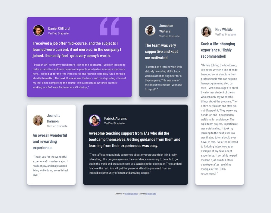


Design comparison
SolutionDesign

Community feedback
- P@dev-ethanjohnPosted 21 days ago
You are almost there! I noticed on tablet screens, you forget to define a specific layout for it using grid (Please check your figma file for reference).
After checking your code, I made a few recommendation:
- Preferably, use HTML semantic tags over divs for better accessibility and SEO. Example such as article, section tags and blockquote tags. If you still unsure what semantic tags to structure your HTML, you can check mine or other solutions in the community.
- Use
emfor your media queries, using px is okay but that doesn't scale. There are a lot of advantages usingemlike it is relative to the browser's root font-size (usually at 1em = 16px by default). If a user changes the font-size to say 18px on their browser, then 1em = 18px; allowing breakpoints to scale and adapt. - You can stick with grid even at smaller screen sizes. Grid can also do vertical column without needing Flexbox, this allow you to not override your body again on tablet or desktop screens. Moreover, it simplifies your media queries!
I hope it helps!
0@SylvainPS78Posted 21 days ago@dev-ethanjohn Thanks for such detailled and wise feedback !
I appreciate that. I'm not yet very familiar with relative units like em but I'll give it a try !
0

Please log in to post a comment
Log in with GitHubJoin our Discord community
Join thousands of Frontend Mentor community members taking the challenges, sharing resources, helping each other, and chatting about all things front-end!
Join our Discord