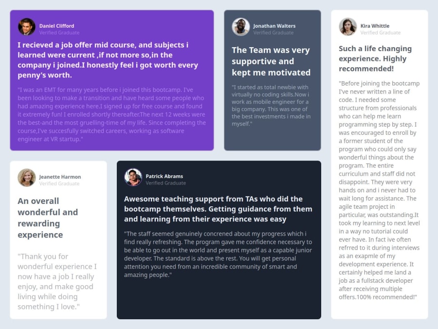


Design comparison
SolutionDesign

Solution retrospective
What are you most proud of, and what would you do differently next time?
I was able to make the layout using flexbox first. But the right card was impossible then i did some research. I tried grid, Using the grid it became easy , and i was able to do it easily. But this will help me focus on topics i must revise again.
What challenges did you encounter, and how did you overcome them?As i said how to approach the design is the problem i used to face but now im able to break down the problem a little easily in my mind, im feeling proud of myself. I think i can do more challenges and become better overall.
What specific areas of your project would you like help with?Well i would love for other to review my work and give me effective feedback, mostly that only.
Please log in to post a comment
Log in with GitHubCommunity feedback
- @i000o
- Font is "Barlow Semi Condensed".
- You can add some
paddingto your cards. Trypadding: 10px 30px; - Research
background-imageas a property to get the quotation mark in the Daniel's card. You can import viaurl()as the value. You can also usebackground-position,background-repeat: norepeat;andbackground-sizeto style it. - You can use the HTML element
<br>to insert a line-break where you want it in text. - Try using Sass or another pre-processor for your CSS to save you work and make your code DRY (Don't Repeat Yourself). It's helped me.
- I added some
margin-leftto Kira and Jeanette's card to make the lines match the design a bit more.
Marked as helpful

Join our Discord community
Join thousands of Frontend Mentor community members taking the challenges, sharing resources, helping each other, and chatting about all things front-end!
Join our Discord