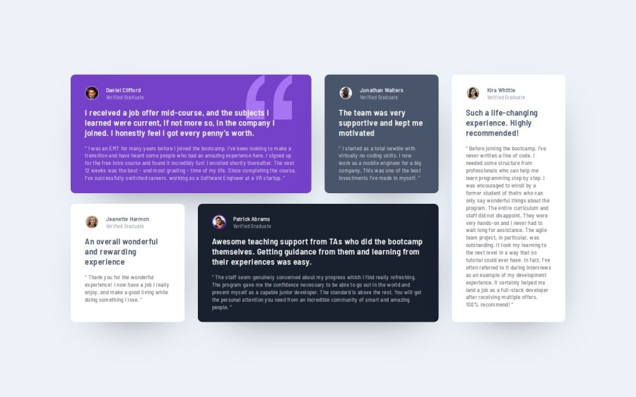


Design comparison

Solution retrospective
I liked that the end result reflected pretty much the expected one.
I've also proven that the strategy of first doing and MVP in CodePen that deals with the heavy lifting (layout, responsiveness, etc.) and then bringing that on to the actual code, in order to add the finishing touches (like the background image and colors, the border-radius, etc.) definitely works well for me.
What challenges did you encounter, and how did you overcome them?Well, this was a nice project to test-run your layout skills (and in my case learn even further about it, too).
I first used a grid for mobile screens and then, with container queries, went up to grid areas. However, my assumption was that by creating grid areas, the columns and rows would automagically take 1fr each. Why? No idea. :) However, that wasn't the case. Columns took different widths.
The thing is I was glad to find this article where, already in the first paragraph, Rachel Andrews explains that you still set this through grid-template-columns/rows, even if using grid areas.
Another challenge/learning was related to background-position, which I thought would take logical properties, but I tried them to no avail. Turns out they're working on a background-position-inline and background-position-block (in CSS Backgrounds Module Level 4) but, as clearly stated there, it's still not ready for implementation. However, I did not want to use just left or right (that would leave any browser with different language direction, etc., with weird layouts), and anyway, the design did not want me to use the background-image at the very corner either.
The solution? You can use a (double) percentage syntax, with the first one being the inline axis (for now the horizontal only I think) and the second percentage, the vertical one.
What specific areas of your project would you like help with?Any advice or hint as to what I might have missed in terms of pure styling, layout and/or responsiveness is welcome.
But also, something that I'd like to know is if there's any better way to select the cards than just going one by one like .card-1, .card-2 (or nth-child(1n), nth-child(2n)), etc. I think due to the very nature of the selectors (for example, assigning a different background color to each) that's not possible, but just in case I thought I'd ask. I know about CSS nesting, but adoption is still lower than 95% according to Caniuse, so I preferred to abstain for now.
Community feedback
Please log in to post a comment
Log in with GitHub
Join our Discord community
Join thousands of Frontend Mentor community members taking the challenges, sharing resources, helping each other, and chatting about all things front-end!
Join our Discord