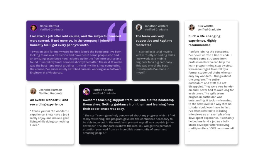
Testimonial grid, Did my first Dark mode on this one. Use of Css grid.
Design comparison
Solution retrospective
Tried to stick with html symantics a lot, please let me know what I did wrong, so I can get more knowledge. And also, please try my dark mode and give feedbacks/ reviews.
Community feedback
- @VCaramesPosted about 2 years ago
Hey there!👋 Here are some suggestions to help improve your code:
-
As a I begin to increase/decrease my screen size, your content breaks apart. I recommend checking you code to see what is causing that.
-
Add a
max-widthto the component’s container to prevent it from warping on larger screens. -
The Article Element is not the best choice for wrapping these testimonials. In order to use the Article Element the component needs to be able to make sense on its own and is independently distributable (can be used in on another site). These testimonials cannot do neither.
Instead, you want to wrap each individual testimonial component in a Figure Element, the individuals information should be wrapped in a Figcaption Element and lastly, the testimonial itself should be wrapped in a Blockquote Element.
Code:
<figure>
   <figcaption></figcaption>
   <blockquote></blockquote>
</figure>
More Info:
- Your CSS Reset is extremely bare and being underutilized. To fully maximize your CSS reset, you want to add more to it.
Here are few CSS Resets that you can look at and use to create your own or just copy and paste one that is already prebuilt.
https://www.joshwcomeau.com/css/custom-css-reset/
https://meyerweb.com/eric/tools/css/reset/
http://html5doctor.com/html-5-reset-stylesheet/
If you have any questions or need further clarification, let me know.
Happy Coding! 👻🎃
0 -
- @correlucasPosted about 2 years ago
👾Hello @chukwudobe-Micah, congratulations on your new solution!
I’ve some suggestions for you:
Its really nice that you’ve used some animation and effects! Something to improve the accessibility its to add a media query reducing the motion.The prefers-reduced-motion CSS media feature is used to detect if the user has requested that the system minimize the amount of non-essential motion it uses. Here’s the code for that:
/* Remove all animations, transitions and smooth scroll for people that prefer not to see them */
@media (prefers-reduced-motion: reduce) {
  html:focus-within {
    scroll-behavior: auto;
  }

  *,
  *::before,
  *::after {
    animation-duration: 0.01ms !important;
    animation-iteration-count: 1 !important;
    transition-duration: 0.01ms !important;
    scroll-behavior: auto !important;
  }
}
✌️ I hope this helps you and happy coding!
0@chukwudobe-MicahPosted about 2 years ago@correlucas I did this, it's at the bottom of the code, you can check it out. It was the last thing I put, after writing the animations.
0
Please log in to post a comment
Log in with GitHubJoin our Discord community
Join thousands of Frontend Mentor community members taking the challenges, sharing resources, helping each other, and chatting about all things front-end!
Join our Discord
