Not Found
Not Found
Not Found
Not Found
Not Found
Not Found
Not Found
Not Found
Not Found
Not Found
Not Found
Not Found
Not Found
Not Found
Not Found
Not Found
Not Found
Not Found
Not Found
Not Found

Submitted

Testimonial Grid Challenge Completed - HTML and SCSS

@bhaikaju

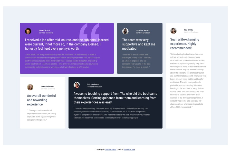
Desktop design screenshot for the Testimonials grid section coding challenge

This is a solution for...

  • HTML
  • CSS
2junior
View challenge

Design comparison


SolutionDesign

Solution retrospective


Please review and provide your comments. I completed this challenge using CSS Grid, hope you will like it.

Community feedback

Muhammad Shajjar• 1,100

@muhammadshajjar

Posted

Hello Bhaikaju!

I agreed with you by your reply to @Eradishub.

I don't think changing h2 to h1 is advisable here because I have multiple h2 tags and as per the best practices, there should be only one h1 element per page, isn't it?

But I think you missed the level one heading h1 in your page.

  • Semantically, I prefer using one h1 on the page, mainly for the title of the page, so as for there is not any visible tittle of the page which you would apply h1, As I , WE know that this is A testimonial grid section or testimonials cards but for those who are visually impaired, they can not see the screen, so how they will know this is a A testimonial grid section or testimonials cards ?? .

here is the solution for it..

HTML
<h1 class=sr-only>Tip calculator app </h1>
CSS
.sr-only {
position:absolute;
left:-10000px;
top:auto;
width:1px;
height:1px;
overflow:hidden;
}

This would help you

Hope it would helps you , keep up the great work :)

0
Eray• 1,410

@ErayBarslan

Posted

Overall good design nice job! As for suggestions, don't give padding & margin to your body and wrapper. I guess you used them to center the content on your screen. But as the resolution changes content loses the position and overflows out of the screen when it gets smaller. To fix that you can get rid of padding & margin and just add:

html { height: 100%; }

body { min-height: 100%; display: grid; justify-content: center; align-content: center; }

Body and wrapper background-color should match aswell. Also you can fix accessibility issues by changing:

  • <h2> to <h1>
  • <div class="wrapper">...</div> to <main class="wrapper">...</main>

Accessibility is important for google search and screen readers. You can check this article to have a general idea: https://www.semrush.com/blog/semantic-html5-guide/

0

@bhaikaju

Posted

@Eradishub Thank you for sharing your thoughts and checking my solution. I agree that using display:grid and align+justify properties I can easily center things on the page but I wanted to keep it simple hence used the margin properties.

I also agree with your advice to replace the div tag with main for accessibility reasons but I don't think changing h2 to h1 is advisable here because I have multiple h2 tags and as per the best practices, there should be only one h1 element per page, isn't it?

Nevertheless, I really appreciate your time and suggestion since you're the first person ever to put a comment for my work. :)

1
Eray• 1,410

@ErayBarslan

Posted

@bhaikaju Well yes ideally a page should have one h1. But like on this challenge, if the sections has equal importance it's better to use h1's instead of h2's in my opinion. It would give better results for SEO.

You're welcome :) It's a good practice for me to review some other solutions.

0

Please log in to post a comment

Log in with GitHub
Discord logo

Join our Discord community

Join thousands of Frontend Mentor community members taking the challenges, sharing resources, helping each other, and chatting about all things front-end!

Join our Discord