Design comparison
SolutionDesign
Community feedback
- @TheDrem94Posted 5 months ago
Great job, You did it! :)
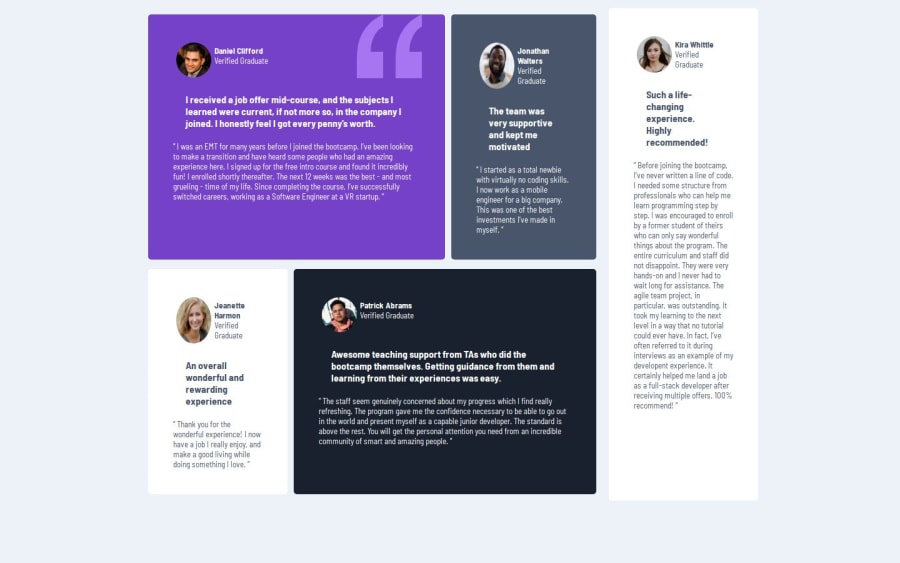
I think using grid in this specific challenge is more comfortable to work with. Some columns are easier to position. I cannot fit mine the exact way, but flex was to hard to use for me it this project. Anywa, one more, good job!
0
Please log in to post a comment
Log in with GitHubJoin our Discord community
Join thousands of Frontend Mentor community members taking the challenges, sharing resources, helping each other, and chatting about all things front-end!
Join our Discord
