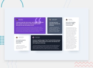
Design comparison
Solution retrospective
Sometimes when you download fonts from google there's a bunch of fonts. Are you supposed to just copy all of them into your project or just some of them?
I've just been picking one and hoping it kind of works out. However, I'm not sure if the font-weights work as well or at all if that's the case.
Community feedback
- @correlucasPosted about 2 years ago
👾Hello Robert, Congratulations on completing this challenge!
I saw your solution preview site and I think it's already really good. Here’s some tips for you to improve it:
1.The box-shadow is a bit too strong, this is due the
opacityandblur. The secret to create a perfect and smooth shadow is to have low values foropacityand increaseblurtry this value instead:box-shadow: 12px 7px 20px 6px rgb(57 75 84 / 8%);If you’re not familiar to box-shadow you can use this site to create the shadow design and then just drop the code into the CSS: https://html-css-js.com/css/generator/box-shadow/
2.You’re in the right track I can see that you’ve used the majority semantic tags possible for this challenge, the only block you’ve missed is the paragraph containing the
quote textyou can improve the accessibility there using<blockquote>to indicate to screen readers that the content inside that paragraph is a quote.✌️ I hope this helps you and happy coding!
Marked as helpful0
Please log in to post a comment
Log in with GitHubJoin our Discord community
Join thousands of Frontend Mentor community members taking the challenges, sharing resources, helping each other, and chatting about all things front-end!
Join our Discord
