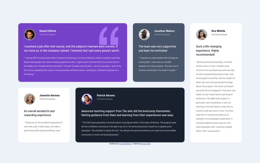
Testimonial-grid-section-column
Design comparison
Solution retrospective
Any remark on the grid code would be highly appreciated.
Community feedback
- @FelixCriolloPosted almost 3 years ago
Good job 🚀 🚀
In
.containeryou could also usegrid-template-areasfor easier the grid layout For example:@media screen and (min-width: 800px) .container { display: grid; grid-template-areas: "pur pur gray w1" "w2 dark dark w1"; gap: 16px; margin: 0 5% 0 5%; padding: 1.2rem; }And then change each
.badges(n)addinggrid-area: pur;(for example)More info about grid-template-areas
Happy coding :3
Marked as helpful1@Nnenna-udefiPosted almost 3 years ago@FelixCriollo Thank you for the feedback. I'm still read up and make the changes
1 - @arkharman12Posted almost 3 years ago
Areas of improvement:
- Media query breakpoint
- Sizing
- Spacing
Good luck!
Marked as helpful1@Nnenna-udefiPosted almost 3 years ago@arkharman12 Thank you for the feedback. Pls can you lay emphasis on the media query breakpoint. Thank you🙏
0 - @abhik-bPosted almost 3 years ago
👋 Hello Nnenna Miriam , Your solution looks nice & responsive , Well Done 🤩🤩🤩
Just a opinion remove the margin from section. Other than that everything looks nice , please keep coding this amazing solutions 👍
Marked as helpful1@Nnenna-udefiPosted almost 3 years ago@abhik-b Thank you for the feedback. I knew that margin was going to be an issue😂. I tried removing it before and it resized the image in the second and fourth sections at the iPad viewport. I'll try to make the changes. Thanks
1
Please log in to post a comment
Log in with GitHubJoin our Discord community
Join thousands of Frontend Mentor community members taking the challenges, sharing resources, helping each other, and chatting about all things front-end!
Join our Discord
