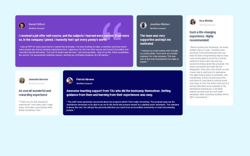
testimonial-frontend

Solution retrospective
i learnt responsiveness
What challenges did you encounter, and how did you overcome them?i suffered a bit with responsiveness but hey I conquered them
What specific areas of your project would you like help with?none
Please log in to post a comment
Log in with GitHubCommunity feedback
- @teuthix
I noticed when you shrink the width of the window, when it is <500px, the cards display in one column. Then when the width is between 500px and 768px, it is in two columns that get cut off by the edges of the window. Then when it is between 768px and 800px, it is one column again. I believe this is because your media queries at the bottom of your css. The media query for
max-width:768pxcontains this:.gridone{ flex-direction: row; }and the media query formax-width:800pxcontains this:.gridone{ flex-direction: column; }. I believe this may be causing your problem!Marked as helpful - @radriann21
Your project looks great!
You should correct the colors only, and add some semantic HTML. It is necessary to learn semantic HTML because it allows you to give more meaning to what is being built, especially to search engines.
You could also use grid here, I recommend some resources to understand grid at least at a basic level:
I hope you can continue practicing and improving!


Join our Discord community
Join thousands of Frontend Mentor community members taking the challenges, sharing resources, helping each other, and chatting about all things front-end!
Join our Discord