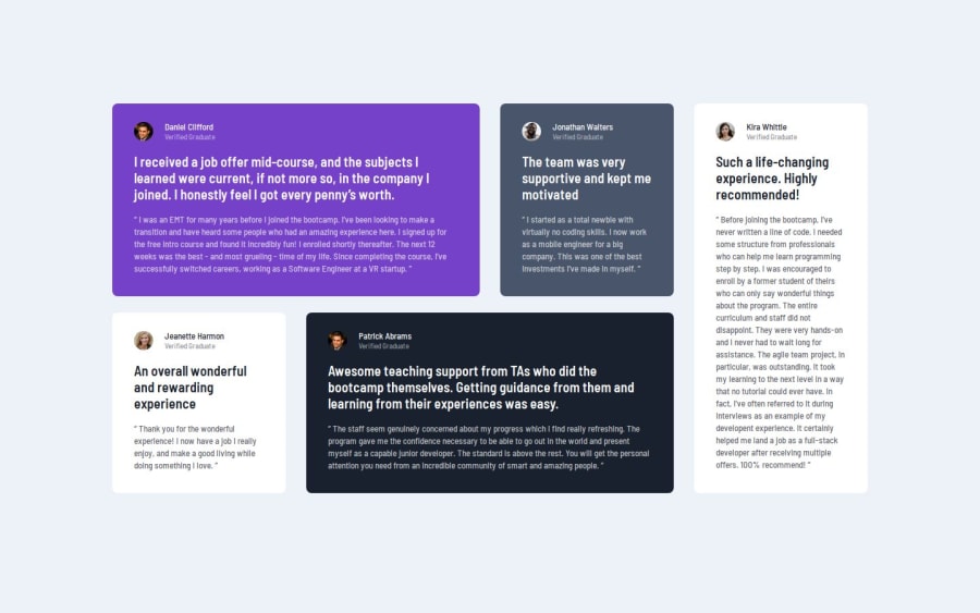


Design comparison

Solution retrospective
I'm proud of using the BEM . I learned minmax for grid, but haven't got a closer look at the grid basics... will submit the solution again after get more concepts of the responsive grid
What challenges did you encounter, and how did you overcome them?Learned to use BEM
What specific areas of your project would you like help with?Responsive page using grid.
Any suggestion is appreciated!
Please log in to post a comment
Log in with GitHubCommunity feedback
- Account deleted
Hi. Good Job. The typography needs a bit of work regarding line-height, font-sizes, and more to make them fit their card containers. The design calls for the card to be about the size of the content. For responsiveness, I tackled this challenge recently using grid-template-areas. This is simpler and more intuitive to use than having to deal with grid line numbers. In your current solution, if you open it up and slowly shrink your browser window, there is a point where the cards are being squished too much before switching to the next media query. The solution is to either adjust the media query so that it switches before it gets squished, or to set a minimum width on the cards in your template-columns using minmax appropriately. You can use your browser dev tools to get the sizes.
You can do something like
@ media (desktop) { 'c-1 c-1 c-2 c-3' 'c-3 c-5 c-5 c-3' }
@ media (tablets) { Here, I did a two column solution) 'c-1 c-1 'c-2 c-4' 'c-3 c-3' 'c-5 c-5' }
And for mobile I did the typical one column solution: @ media (mobile) {
'c-1' 'c-2' 'c-3' 'c-4' 'c-5' }
You can see my solution on my page.
Marked as helpful - @AkoToSiJeromeEh
Hey ! Great work out there i just notice you using padding-right , padding-left , padding-right and padding-bottom in .container , i suggest to use shorthand for declaring a padding like that ex padding : 4em(top) 1.5em(right) 4em(bottom) 1.5em(left) or in you case
padding : 4em(top and bottom) 1.5em(top and right), its much cleaner and less code for me . that's all happy coding !!Marked as helpful

Join our Discord community
Join thousands of Frontend Mentor community members taking the challenges, sharing resources, helping each other, and chatting about all things front-end!
Join our Discord