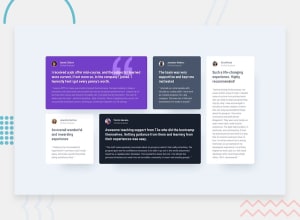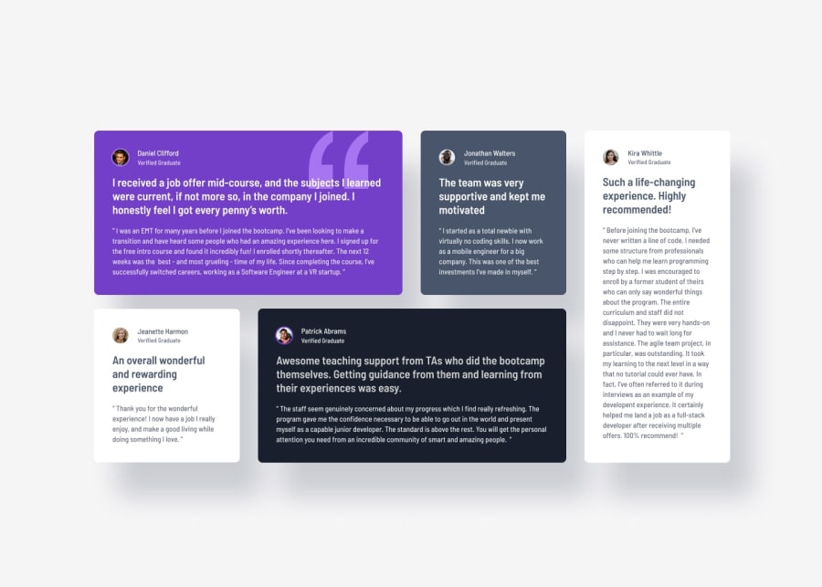
Design comparison
Please log in to post a comment
Log in with GitHubCommunity feedback
- @defPhisy
Looks great Michael 👍
-
Does the solution include semantic HTML? Yes!
-
Is it accessible, and what improvements could be made? Yes, you had the same accessibility issue with h2 😂. Nice hack with h1 hidden. I was to lazy for that. For screenreader it is redundant to use a alt text for the images. They have no meaning you have already the name in h2. I would omit the alt text.
-
Does the layout look good on a range of screen sizes? Yes, you could improve the transition between your mobile and desktop a bit better. When reducing screen size form desktop to mobile around 1080px width your layout shrinks. At this point it is not responsive. The font-sizes getting very small.
-
Is the code well-structured, readable, and reusable? Yes!
-
Does the solution differ considerably from the design? Yes, an improvement would be better matched font-sizes and font-weights
-
Join our Discord community
Join thousands of Frontend Mentor community members taking the challenges, sharing resources, helping each other, and chatting about all things front-end!
Join our Discord
