

Design comparison

Community feedback
- @PresidentTree94Posted 5 days ago
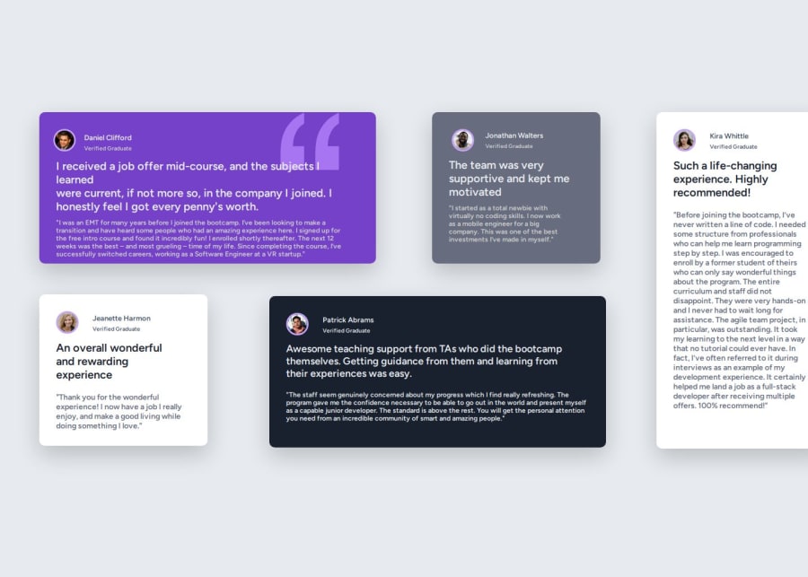
I do not mean for you to take this the wrong way, but did you read the entire style guide? The design references? All of the colors are available for you to copy and paste. Only Daniel and Patrick should have image borders. The font is called "Barlow Semi Condensed" and is available on Google Fonts.
Marked as helpful0@NecronytePosted 5 days ago@PresidentTree94 Sometimes i get confused in that google fonts website i cant understand what the true font is. Because of i am an amateur at this i think. If we talk about the colors some colors looks like almost same as the design but when i look at my website after added on here i can see the differences. Thats my fault. I need to get better on this. And thank you for your comment!
0@PresidentTree94Posted 5 days ago@Necronyte, I do not mean to blame you. If you have trouble understanding the guide, that is fine. As you said, you are new at this. I do admit that some of the colors are similar to it takes a lot of guessing and checking the design files. As for Google Fonts, it is actually quite simple:
- Follow the link provided in the guide.
- Select "Get font" in the top right.
- Remove any extra fonts from previous sessions that you no longer need if you have used it before.
- Select "Get embed code" to the right.
- Decide whether you want to copy and paste the <link> into your HTML or the @import into your CSS.
- Follow the instructions on how to use it in your project.
Marked as helpful0

Please log in to post a comment
Log in with GitHubJoin our Discord community
Join thousands of Frontend Mentor community members taking the challenges, sharing resources, helping each other, and chatting about all things front-end!
Join our Discord