Design comparison
Community feedback
- @AdrianoEscarabotePosted about 2 years ago
Hi AhmedGamalDev8, how are you?
congratulations for completing another challenge, I really liked the result of your challenge, but I have some tips that I think you will like:
1- Document should have one main landmark, you could have put all the content inside the
maintag click here2- Page should contain a level-one heading click here
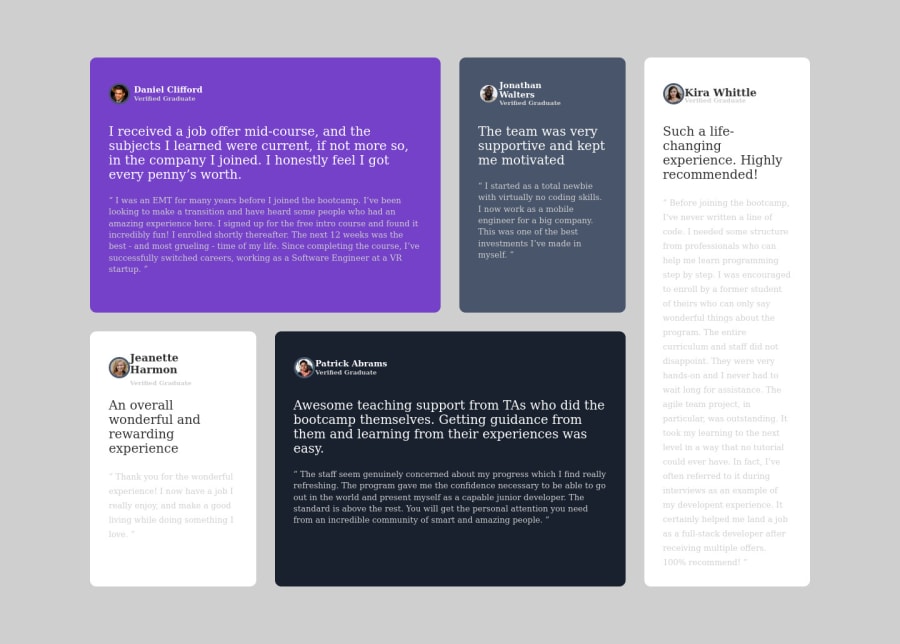
I noticed that the font-family is not the same as the layout of the example, and the background color, if you did it on purpose it's ok to customize the challenges including I have some custom ones too. But if it was because you didn't know how to find the font-family or the background color, there is a file named
style-guide.mdthat comes with the images you download to do the challenge, it has them all the colors used in the project.Hope it helps... 👍
The rest is great!!
Marked as helpful0@AhmedGamalDev8Posted about 2 years ago@AdrianoEscarabote Thanks dear adriano really this is the first time to me on coding a project but next time i will try my best to do it great, Again thanks from my heart.
1@AdrianoEscarabotePosted about 2 years ago@AhmedGamalDev8 I'm glad to have helped! keep coding so i can try to help you again! 👍
Marked as helpful1 - @correlucasPosted about 2 years ago
👾Hi Ahmed Gamal, congrats on completing this challenge!
I've just opened your live site and I can say that you did a great job putting everything together! There's some tips to improve your solution:
1.You've missed the color for the background, in this case is
background-color: #EDF2F8and add it to the body.2.Your html is working but you can improve it using meaningful tags and replace the divs, for example the main div that takes all the content can be wrapped with
<main>or section, about the cards you can replace the<div>that wraps each card with<article>you can wrap the paragraph with the quote with the tag<blockquote>this way you'll wrap each block of element with the best tag in this situation. Note that<div>is only a block element without meaning, prefer to use it for small blocks of content.This article from Freecodecamp explains the main HTML semantic TAGS: https://www.freecodecamp.org/news/semantic-html5-elements/
3.The colors you’ve used are a little bit different from the original colors.When you download the project files there’s a file called
style-guide.mdwhere you can find information such asfont-family,hsl color codes, device sizes and thefont-sizefor the headings.✌️ I hope this helps you and happy coding!
0
Please log in to post a comment
Log in with GitHubJoin our Discord community
Join thousands of Frontend Mentor community members taking the challenges, sharing resources, helping each other, and chatting about all things front-end!
Join our Discord
