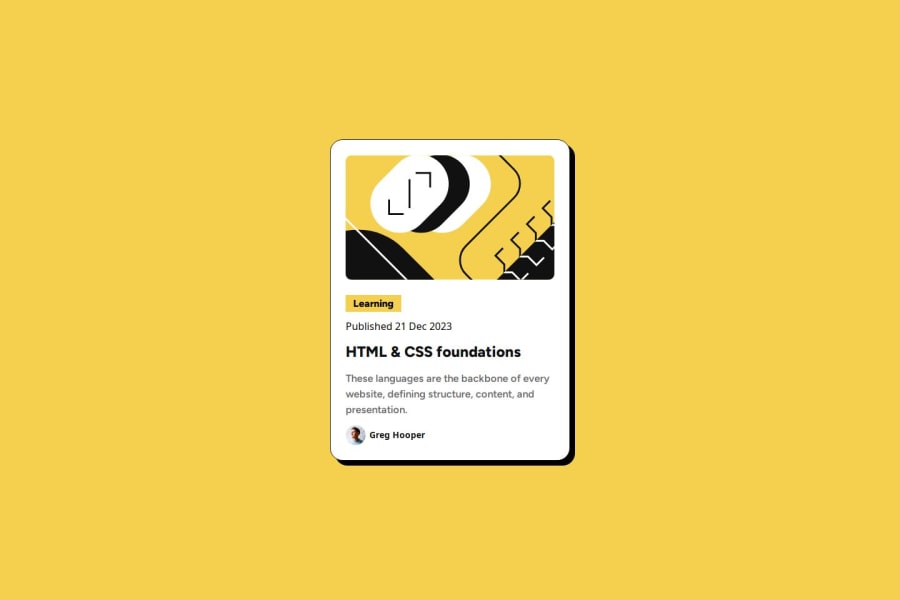
Design comparison
Solution retrospective
Not practiced CSS for a while, so I wanted to gain some practice
What challenges did you encounter, and how did you overcome them?Even with figma, I still feel this was slightly out. Any reasons why?
What specific areas of your project would you like help with?The layout why is this slighlty smaller when the padding is the same on figma
Community feedback
- @dylan-dot-cPosted about 3 hours ago
What you did was great only thing is to use the header elements properly and in order, h1,h2,h3... If you want to change appearance just do it with css.
Another thing you can do is make proper use of semantic HTML Like you have a header and main used for the card content, you might be thinking of it too hard, in a real world environment you would have more than one of these cards, so would it make sense to have a main and a header in each? I would use the main/body as the wrapper so I don't need an additional div, you could use an article/section element for the card container.
You don't need to set the body to 100% as it always takes you full width so that's redundant
It could be something small like some line spacing or extra margin/padding why it's off
Other than that you should be good
0 - @huyphan2210Posted about 6 hours ago
Hi, @leecockcroft
I checked out your solution and saw your question. While I’m not a Pro user and can’t access Figma, here's my attempt to answer it:
- Are you sure your solution matches the
margin
,padding
, and other spacing exactly as in the Figma design? It’s a lot of meticulous work, and it’s easy to miss small details. - If your spacing is correct, have you considered the
font
? Differences infont-weight
,font-size
,line-height
, andletter-spacing
can affect the look significantly. Checking all these factors takes time. - Personally, I don’t think achieving an exact 100% match is feasible—or even ideal. Aiming for a near match is good, but a perfect match might compromise other aspects, like responsiveness (since the design targets specific viewport dimensions) or maintainability (I feel your code might benefit from simplification for easier maintenance).
Hope this helps!
0 - Are you sure your solution matches the
- @HsasasbhgfPosted about 6 hours ago
it is awesome, try to get Prettier extension in your vs , just to clean your html page , and another thing in css , try to put box-size to border box , search about it its really useful.
0
Please log in to post a comment
Log in with GitHubJoin our Discord community
Join thousands of Frontend Mentor community members taking the challenges, sharing resources, helping each other, and chatting about all things front-end!
Join our Discord