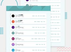
Design comparison
Solution retrospective
This one was more complicated to submit and have a visible project screenshot. But it works, seems bug free, and I finished it .
What challenges did you encounter, and how did you overcome them?I needed help with getting the project screenshot to be a fully loaded normal design image. I had to ask at Discord and someone pointed me in the right direction (by mentioning Lighthouse ), and I googled the name , added the extension to my brouwser and it pointed me to areas that were too slow , or causing a slower load.
I fixed those problems as best as I could . Finished with a performance score of 96, accessiblity score of 91, best practices score of 100, and seo score of 91 (as of nov 9 2024).
What specific areas of your project would you like help with?Clearly , I need to dive deeper into how to avoid/eleminate 'render blocking resources' firstly. I'm mostly confused by this error , as I've always learned that you need to keep styling/semantics separate , and now (for the first time) I hear that no, you should not do that as it causes the fist load to be too slow.
I'm very frustrated by this as I have no idea how to avoid these errors in the future, without having to keep all my css separate in the `
Community feedback
Please log in to post a comment
Log in with GitHubJoin our Discord community
Join thousands of Frontend Mentor community members taking the challenges, sharing resources, helping each other, and chatting about all things front-end!
Join our Discord
