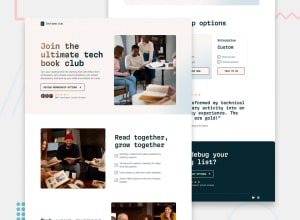
Design comparison
Solution retrospective
Dealing with all the size/font-size changes through the various media queries pushed me to look for different ideas/implementations for my design system. I need to to step up my layout skills, I waste too much time on choosing what to use between flex and grid...
What challenges did you encounter, and how did you overcome them?Sizes, font-sizes and layout changes between the different media queries were the major challange for me.
What specific areas of your project would you like help with?Any suggestion is welcome. Accessibilty tips would help a lot.
Community feedback
- @catherineisonlinePosted 10 days ago
Hello, nice solution, I have not done this one yet, looks pretty cool!
I have a couple of suggestions for accessibility that I would make a bit different, it doesn't necessarily need to be like this.
👉 #1 If you decided to place the footer outside, I would also place the header away from the hero as the header doesn't really belong there, I think, and can cause confusion structure-wise. We also need to use
headertag.<header class="hero__header"> <div class="logo-container"> <img src="/assets/images/logo.svg" alt="Tech Book Club logo"> </div> </header>I don't see the need for an extra div around the image because the image is already standalone and can easily be styled without any external controller container.
Besides, if the image is the company logo, I wouldn't rely on only
alttext. It's better to add actual text e.g.<h1 class="visually-hidden">Tech Book Club</h1>and hide it with CSS. It will be hidden from UI but the screen reader will understand it.👉 #2 Section tags always need text that describes them but sometimes we might not have a heading right under the section like in your scenario due to styling reasons
<section class="hero">Because the screen reader would need to announce the section content the way it makes sense. You can usearia-labelledbyand add an id of the heading somewhere below.We can use
<h1 class="heading-1 margin-block-end-6">Join the ultimate tech book club</h1>So it would be :
<section class="hero" aria-labelledby="hero-title">
....
<h1 id="hero-title" class="heading-1 margin-block-end-6">Join the ultimate tech book club</h1>
Considering that we already added h1 to the structure, we usually use only one h1 heading, so the next one shall be
h2(which can be repeated compared to h1).<h2 id="hero-title" class="heading-1 margin-block-end-6">Join the ultimate tech book club</h2>This applies to other sections you have. If the heading isn’t a direct child of the section, we need to attach the heading if it’s deeply nested.
So we need to improve
<section class="section community"><section class="section journey"><section id="membership-tiers" class="section membership">👉 #3 Images don’t need any alt text if they are decorative. Non-decorative would be an arrow in the button where there is no text and the arrow itself triggers the action or an image that describes the scenario present in the text around it which is important. If it’s just decorative you can keep the alt tag empty but also add
aria-hidden="true”so the screen reader skips it.Examples of the decorative in this case will be:
  <img
src="/assets/images/icon-arrow-down.svg"
alt=""
aria-hidden="true"
                />
<img src="/assets/images/image-avatars.webp" alt="" aria-hidden="true" />And once again, you don’t need the extra divs around the images until you need some extra styling. If you need a colored overlay then yes, you can do something with div and make it wrap the image.
👉 #4 It’s always much better to use semantic tags instead of div, especially when it’s something important. For testimonials, you can also use
blockquoteand add a footer for the author:<blockquote> <p>"This book club transformed my technical reading from a solitary activity into an enriching community experience. The discussions are gold!"</p> <footer> <p><strong>Sarah Chen</strong>, Software Architect</p> </footer> </blockquote>All this has no semantic meaning but in reality, we do want this text to be important because it’s a testimonial!
👉 #5 Add labels or hidden text to
buttons/atags when there is no text and the image instead.<a href="#"> <img src="/assets/images/logo-bluesky.svg" alt="Bluesky social media logo" /></a>This would be read something like “Bluesky social media logo, link” which isn’t very clear so you could add a label to describe the link and maybe even make the image decorative in this case.
<a href="#" aria-label="Bluesky Social Media">
  <img src="/assets/images/logo-bluesky.svg" alt="" aria-hidden=“true”>
</a>
so this should become something like “Bluesky Social Media, link”.
Finally, some things can be a preference and done differently, there isn't always one rule for everything. Also depends on the target audience. Even modern tags are not supported on older browsers if by chance you have a visitor with an ancient browser you can add roles but for such projects this is extra.
There is much more that can be changed but I hope these small changes help you out 😁 🔥
Marked as helpful0P@elCris99Posted 5 days ago@catherineisonline Thank you so much for all the advice you gave me, I will try to implement it in the next projects. I will improve my use of semantic html and the accessibility of my web pages.
0
Please log in to post a comment
Log in with GitHubJoin our Discord community
Join thousands of Frontend Mentor community members taking the challenges, sharing resources, helping each other, and chatting about all things front-end!
Join our Discord
