
Tech Book Club Page | React ⚛️ + Tailwind 🎨 + Framer-Motion 🎞️

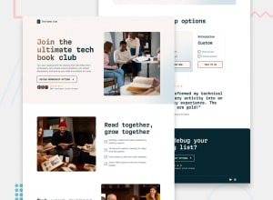
Design comparison
Solution retrospective
I added some new features I don't normally include:
- Scroll animations with motion
- Lazy loading images for better page load times
- Text gradients
- Dealing with two background images
Next time, I would style with each breakpoint in mind. This whole project was done chronologically from mobile to tablet to desktop styles.
This approach worked well, but sometimes I had to add a div or style for larger viewports that broke the smaller viewport styles.
What challenges did you encounter, and how did you overcome them?Implementing the following new technologies required looking through documentation and tutorials:
- motion
- react-lazy-load-image-component
I had a hard time figuring out:
- How to set a max-width for the page while keeping the background images covering the entire screen
I wanted to prevent the webpage from being too wide for large viewports. Setting a max-width cut off the background image and left undesirable whitespace on my page's left and right sides.
How can I get around this next time?
Community feedback
Please log in to post a comment
Log in with GitHub
Join our Discord community
Join thousands of Frontend Mentor community members taking the challenges, sharing resources, helping each other, and chatting about all things front-end!
Join our Discord