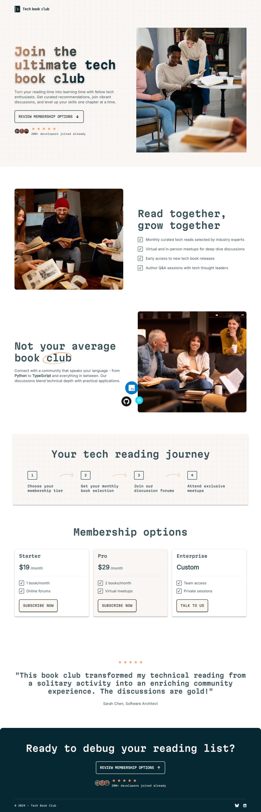
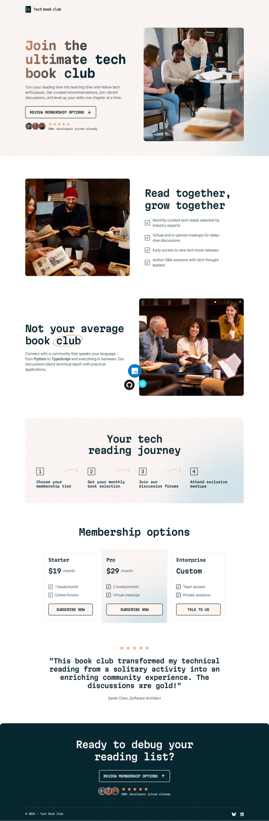
Tech book club landing page

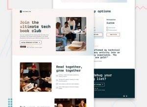
Design comparison
Solution retrospective
I'm satisfied that I managed to get most of the page correct. I figured out how to do the gradient heading ("Join the ultimate tech book club"), and the circle around the word "club". I also liked how I used data-attributes to style component variants - for example, there are 2 "Review membership options" button links, which share a lot of styles. I gave both a class, which I used for the common properties. Then, I used data-position to change things like background color and background gradient on :hover.
As usual, there were a lot of challenges, small and big. I couldn't figure out the blue "background glow" which is supposed to be on several sections, including the hero. I tried using an absolute positioned ::after pseudo-element, but it didn't appear at the edge without causing horizontal overflow. As it is mostly decorative, I decided to let it go, and accept that the rest of my solution is pretty good. It's a fact that I neither like or is skilled in things like positioning, transform, background images, etc. Layout and spacing, however.... :)
I'm always open for feedback!
Community feedback
Please log in to post a comment
Log in with GitHubJoin our Discord community
Join thousands of Frontend Mentor community members taking the challenges, sharing resources, helping each other, and chatting about all things front-end!
Join our Discord