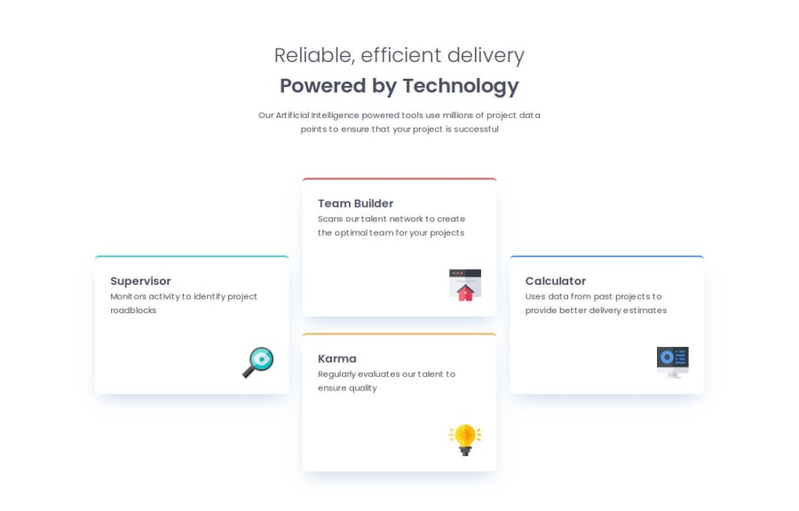
Design comparison
Solution retrospective
Desktop if I give the body 100vh. the layout renders nearly perfect. here. however viewing this on a lap top the header is missing? (which viewing 1440px should be fine) but its dragged above the screen?
What other approach should I do here?
Community feedback
- @LucieLuBPosted 4 months ago
HTML Structure: The overall structure is clear and follows a logical order. It’s great to see the use of semantic tags like <section>, <h1>, <h2>, etc., which help with accessibility and SEO. However, consider using a <header> tag instead of <section class="header"> to enhance semantics even more.
Class Names: The class names are easy to understand, though it could be helpful to be more descriptive for specific sections, especially in a multi-component project. For instance, instead of .left, .middle, and .right, consider names like .feature-left, .feature-center, and .feature-right to indicate their function and context within the layout.
Alt Attributes: Currently, the alt attributes in the <img> tags are empty. Adding descriptive alt text for each image, like “Supervisor Icon,” will make the content more accessible, especially for screen readers.
Consistent Spacing: Some HTML elements have inconsistent spacing around them. Removing unnecessary blank lines and organizing code into clearly defined sections would improve readability. For example, there are several empty lines in the <section class="middle"> that could be removed.
Comment on Inline Style Comment: The comment <!-- Feel free to remove these styles or customize in your own stylesheet 👍 --> doesn’t seem to have an associated style. If there were initial inline styles intended, consider either adding or removing this comment for clarity.
Viewport Meta Tag: Nice job including the viewport meta tag to ensure the site displays properly on all devices. This is essential for responsive design!
File Structure: Since the project may expand, keeping a logical file structure (e.g., separate folders for images, scripts, and styles) is a good practice. You’ve already started by storing images in an images folder, which is great for maintainability.
Typography: The font is correctly imported from Google Fonts, and Poppins is a good choice. Ensure that font-weight values in the CSS reflect the correct weights loaded in the font link.
Page Title: The <title> tag is descriptive, which is good. However, consider removing the placeholder text Frontend Mentor | Four card feature section when the project is finalized to make it more customized.
HTML5 Compliance: Adding a <footer> if necessary and ensuring consistent usage of <main> and <header> will help meet HTML5 standards as the project expands.
Overall, you've done a solid job! These suggestions should help improve the readability, accessibility, and maintainability of the code. Keep up the good work!
1 - @randyluongPosted 4 months ago
The code is easy to read and organized, the layout looks good and are responsive.
0
Please log in to post a comment
Log in with GitHubJoin our Discord community
Join thousands of Frontend Mentor community members taking the challenges, sharing resources, helping each other, and chatting about all things front-end!
Join our Discord
