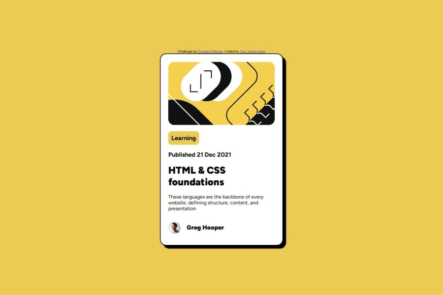
Design comparison
Solution retrospective
Me resulto mas sencillo este proyecto, creo que estoy mejorando en cuanto a la practica
What challenges did you encounter, and how did you overcome them?La verdad no encontre muchos desafios
What specific areas of your project would you like help with?Quiza si existe una manera distinta al usar media y utilizar mas las dimensiones rem y em que me confunden un poco
Community feedback
- @AdrianoEscarabotePosted 5 months ago
Hi Brandon Jr Cortez, how’s everything? I think your project turned out great! However, I have some feedback that I think might be useful:
Consider using
remfor font size .If your web content font sizes are set in absolute units, such as pixels, the user will not be able to re-size the text or control the font size based on their needs. Relative units “stretch” according to the screen size and/or user’s preferred font size, and work on a large range of devices.if you want to continue coding with
px, you can download a very useful extension in vscode, it convertspxtorem!link -> px to rem
A document ought to have one primary landmark, and the absence of a main tag around the page's primary content is the root of this issue. On this page, there is no other element that is more important than the one that this challenge is based on, so to solve it, wrap all the content in the'main' tag.
It's always a good idea to pay close attention to the proper use of semantic html elements because they are crucial for screen reader users to understand what the main content of the page is in the case of the'main' tag!
The rest is amazing.
I hope this is helpful. 👍
Marked as helpful0@BrandonJr20Posted 5 months ago@AdrianoEscarabote Muchisimas gracias, omiti el uso de etiquetas semanticas, y la extension que me brindaste espero usarla proximamente.
1 - @FirstHalcyonPosted 5 months ago
Hey, Brandon, good work, keep it up.
Good job with the box shadow and the border radii, they're spot on. In the future, I'd suggest playing around a bit more with the measurements to get them to look more similar to the design wanted. Look up em vs rem to get a good gist of what they are and how they work.
Marked as helpful0
Please log in to post a comment
Log in with GitHubJoin our Discord community
Join thousands of Frontend Mentor community members taking the challenges, sharing resources, helping each other, and chatting about all things front-end!
Join our Discord
