Tailwind,React,Mobile first dev,
Design comparison
Solution retrospective
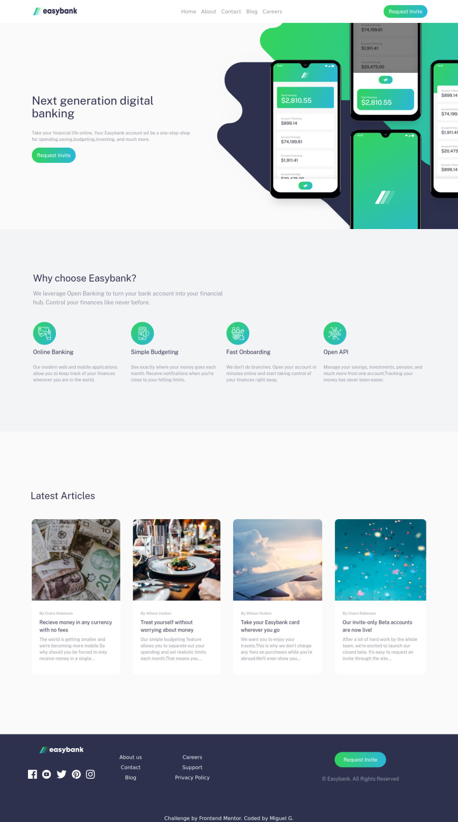
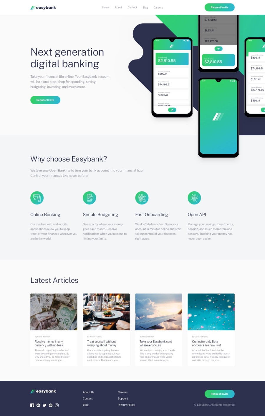
I changed a couple of things. The hover states just zoom in instead of changing colors and have some opacity. I added some slight animations, and also the landing page svg was giving me a bit of a hard time I believe it is because of the way I laid out the sections. The hardest part of the project was the SVG's and positioning them correctly which I believe I still did not do well. Overall fun project probably will do another one just for fun. Theres also a slight bug where if the user opens to modal on a screen width smaller than md and then expands the screen the styling is stuck. Ill probably look more into this. Any feed back is appreciated thanks guys
Community feedback
Please log in to post a comment
Log in with GitHubJoin our Discord community
Join thousands of Frontend Mentor community members taking the challenges, sharing resources, helping each other, and chatting about all things front-end!
Join our Discord
