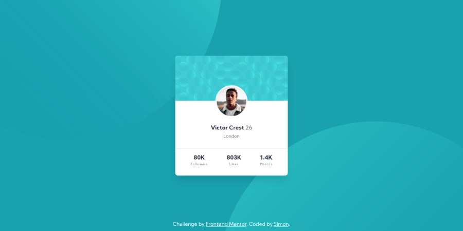
Design comparison
Solution retrospective
Hi Guys!
As always, hope you are doing awesome :)
This time around I decided to submit this small challenge, in order to practice my newly acquired Tailwind CSS skills! (still learning lol).
I find this utility-first framework approach very interesting and useful! I'm excited to see how far I can go with it.
Feedback is more than welcome and much appreciated!
Community feedback
- @ApplePieGiraffePosted over 4 years ago
Good work, Simon! 👍
Kudos for trying Tailwind CSS! 👏 I think your solution looks great! 🙌
Don't forget to add
altattributes to your images! (BTW, a simpler way of adding and positioning those background SVGs might be to use CSS background images since they are... background images!) 😉Keep coding (and happy coding, too)! 😁
1@simonhernandezPosted over 4 years agoHi @ApplePieGiraffe !
Thanks so much for pointing that out! I really struggled positioning those SVGs 😖. Next time I'll definitely try using CSS background properties as you suggested!
I wish you a wonderful Thursday and happy coding! 😁
1
Please log in to post a comment
Log in with GitHubJoin our Discord community
Join thousands of Frontend Mentor community members taking the challenges, sharing resources, helping each other, and chatting about all things front-end!
Join our Discord
