Design comparison
SolutionDesign
Solution retrospective
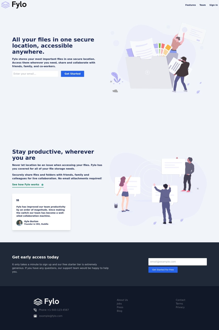
it is difficult for the size input and button , image . can anyone help me with that ? is there anything more to improve?
Community feedback
Please log in to post a comment
Log in with GitHubJoin our Discord community
Join thousands of Frontend Mentor community members taking the challenges, sharing resources, helping each other, and chatting about all things front-end!
Join our Discord
