Design comparison
Solution retrospective
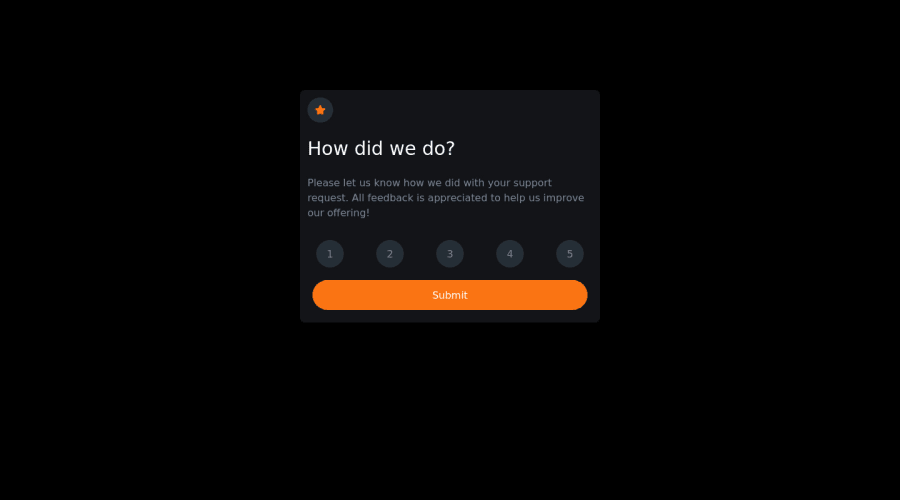
what do you think about this website? do you have any suggestions?
Community feedback
- @DavidMorgadePosted about 2 years ago
Hello Stac4uo, congrats on finishing the challenge, will try to help you as much as you can with some suggestions:
- Instead of using tailwind
marginsto center you component, try using flex-box on the body, you only have to set the bodymin-height: 100vhto get it working, your body should look like this:
body {
  display: flex;
  justify-content: center;
  align-items: center;
  min-height: 100vh;
}
Dunno how you should add it with just tailwind, I'm not familiar with the framework.
-
In your rating buttons, instead of using the active pseudoclass, try using Javascript or the
:focuspseudoelement, cause your background is getting remove after clicking. -
I would change the condition when the user inputs no rating and submit, instead of showing up the 'thank you' card, you can display an alert() window that tells the user that they need to select a rating, try something like this in your Javascript:
submitBtn.addEventListener("click", () => {
  if(!ocena) return alert('You need to select a rating before submitting!')
  mainPart.classList.add("hidden");
  submitPart.classList.remove("hidden");
  let text = document.createElement("p");
  if (ocena != undefined) {
    text.textContent = `You selected ${ocena} out of 5`;
  }
  addRate.appendChild(text);
});
Hope my feedback helps you!, if you have any questions don't hesitate to ask! good job!
Marked as helpful0 - Instead of using tailwind
Please log in to post a comment
Log in with GitHubJoin our Discord community
Join thousands of Frontend Mentor community members taking the challenges, sharing resources, helping each other, and chatting about all things front-end!
Join our Discord
