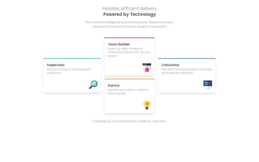
Design comparison
SolutionDesign
Solution retrospective
Hello,
Advice is greatly appreciated.
Community feedback
- @javascriptor1Posted over 1 year ago
Hi John ,
Nice work. The 2 heading in the header are not separated in mobile view.
They are mixed together like below :
Reliable, efficient delivery Powered by Technology
Keep coding 🚀
0@Soto-JPosted over 1 year ago@javascriptor1 Thank you, I didn't take tablet view into consideration.
0
Please log in to post a comment
Log in with GitHubJoin our Discord community
Join thousands of Frontend Mentor community members taking the challenges, sharing resources, helping each other, and chatting about all things front-end!
Join our Discord
