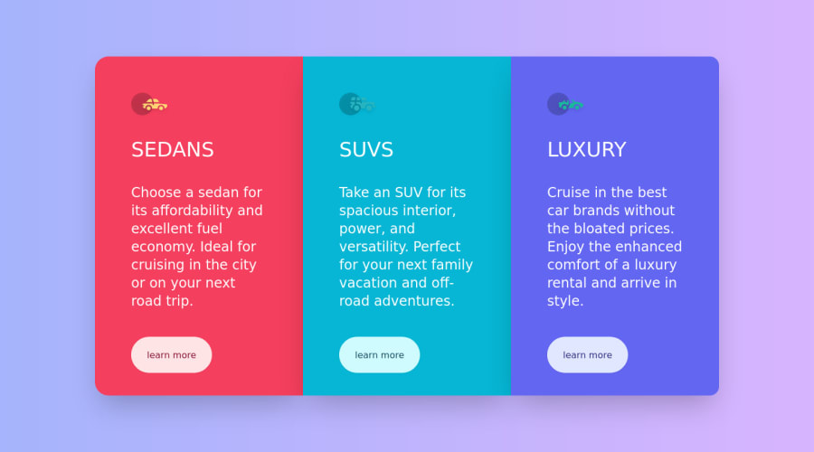
tailwindcss, dark- and light theme and tablet design added
Design comparison
Solution retrospective
Hey there, this one doesn't have anything fancy this time 😅, This is my first experience with tailwind, I tried to make it as simple as possible no animation no cool effects (You can check out my other solutions to realize what I meant) well I was kinda used to writing out vanilla css, this is not my first UI framework, I already knew bootstrap but I got to tell you, I was really surprised when I learned tailwind today, it was not much like bootstrap, because it's a utility first framework it gives you much more freedom, It's like writing css but in class attribute, It can help you a lot to speed your coding, this little project only took me 50minute to finish which is fantastic, I am planning ahead to build a couple of more projects using tailwind, well I know you guys won't care, but stay tuned I have some amazing ideas and bizarre innovations coming 😂, oh btw change your os theme to see light/dark theme as well. thank you for your attention.
Community feedback
Please log in to post a comment
Log in with GitHubJoin our Discord community
Join thousands of Frontend Mentor community members taking the challenges, sharing resources, helping each other, and chatting about all things front-end!
Join our Discord
