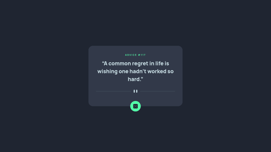
Design comparison
Solution retrospective
Feedback Welcome :)
I spent 1 hour before going to bed.
What I learn :
I found targeting-a-breakpoint-range in tailwindcss such as "max-md-*" help me a lot for responsive in mobile.
Community feedback
- @tomazi15Posted over 1 year ago
HI
Well done for completing this challenged visually it is really good! and i love tailwind css my self it allows to produce a simple to advanced design very quickly! css it self can be annoying especially when you have to manage multiple break points and write a
@mediaquery for them.Small if you have adde
tailwind.configin your html you can removetailwind.configfrom the root. Also its a good practice to keep yourjsin separate file as well asroot cssrules ie:bodyorhtml.I would also recommend looking into semantic html.
Keep it going 👌
Marked as helpful1@mjkodkksPosted over 1 year ago@tomazi15 Thank you for your feedback :D
I will fix it and looking semantic HTML. 🥰
0
Please log in to post a comment
Log in with GitHubJoin our Discord community
Join thousands of Frontend Mentor community members taking the challenges, sharing resources, helping each other, and chatting about all things front-end!
Join our Discord
