Not Found
Not Found
Not Found
Not Found
Not Found
Not Found
Not Found
Not Found
Not Found
Not Found
Not Found
Not Found
Not Found
Not Found
Not Found
Not Found
Not Found
Not Found
Not Found
Not Found

Submitted

TailwindCSS & JavaScript Build

P
Dean 480

@Deanogit

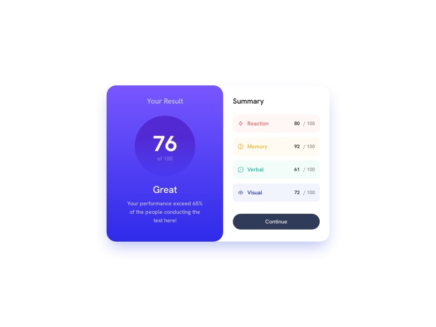
Desktop design screenshot for the Results summary component coding challenge

This is a solution for...

  • HTML
  • CSS
1newbie
View challenge

Design comparison


SolutionDesign

Solution retrospective


I'm practicing writing my code in Bem principles, any pointers would be greatly appreciated, thanks for taking a look :)

Community feedback

@AGutierrezR

Posted

Hello there Dean 👋. Good job on completing the challenge!

I have some suggestions about your code that might interest you.

Although you are not styling by BEM principles, you are doing great with the naming convention, when you mix Tailwind with something like BEM or CUBE CSS, you could use these non-utility-classes to create some reusable or unique elements. For example:

  • Each .summary__item you use this non-utility-class to add the padding, border-radius, flex container and distributions, and then you could use tailwind to add the colors or to add the margin between each other.

I hope you find this helpful 😁. Most importantly, your submitted solution is fantastic!

Happy coding!

Marked as helpful

1

P
Dean 480

@Deanogit

Posted

@AGutierrezR Thank you so much for taking a look at my solution

Thanks for your feedback regarding my use of naming conventions.

So if I understand you correctly, I can style the .summary__item with styles I would repeat by using tailwind in the html, and instead put this in a CSS file.

This will help to clean up my code!

Thanks again @AGutierrezR, this is really helpful :)

0
Daniel 🛸 44,230

@danielmrz-dev

Posted

Hello, Dean!

Your project looks great!

Nice use of tailwind!

I have a suggestion for you to improve it:

  • Try adding md:h-screen to the body. This will place your card in the middle of the page on desktop version, since you are already using flex justify-center items-center.

I hope it helps!

Other than that, excelent job!

Marked as helpful

1

P
Dean 480

@Deanogit

Posted

@danielmrz-dev thanks so much for taking a look at my solution!

Yes I will implement this md:h-screen so the desktop version will place the card in the middle of the page! Thank you :)

I also removed the md:mt-12on the .card and now the screenshot looks almost identical to the design :)

1

Please log in to post a comment

Log in with GitHub
Discord logo

Join our Discord community

Join thousands of Frontend Mentor community members taking the challenges, sharing resources, helping each other, and chatting about all things front-end!

Join our Discord