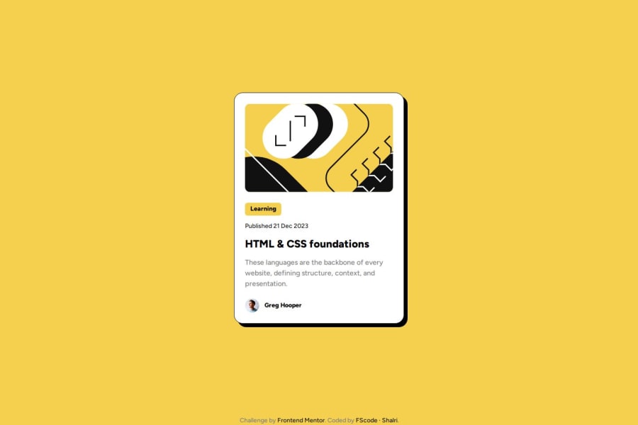
Design comparison
SolutionDesign
Solution retrospective
What are you most proud of, and what would you do differently next time?
I started this challenge without the .fig file because I didn't scroll down enough to see the download button. When I finally saw that the .fig file was downloadable, I compared the measurements from eyeballing it to the figma layout itself. I wasn't far off.
What challenges did you encounter, and how did you overcome them?Using online tools like cssmatic has me a lot with some design elements. I am more focused on layout and structure that these tools give the additional info to complete the challenge.
What specific areas of your project would you like help with?I am all good for now. Looking forward to do more challenges and probably jump into it with React.
Community feedback
Please log in to post a comment
Log in with GitHubJoin our Discord community
Join thousands of Frontend Mentor community members taking the challenges, sharing resources, helping each other, and chatting about all things front-end!
Join our Discord
