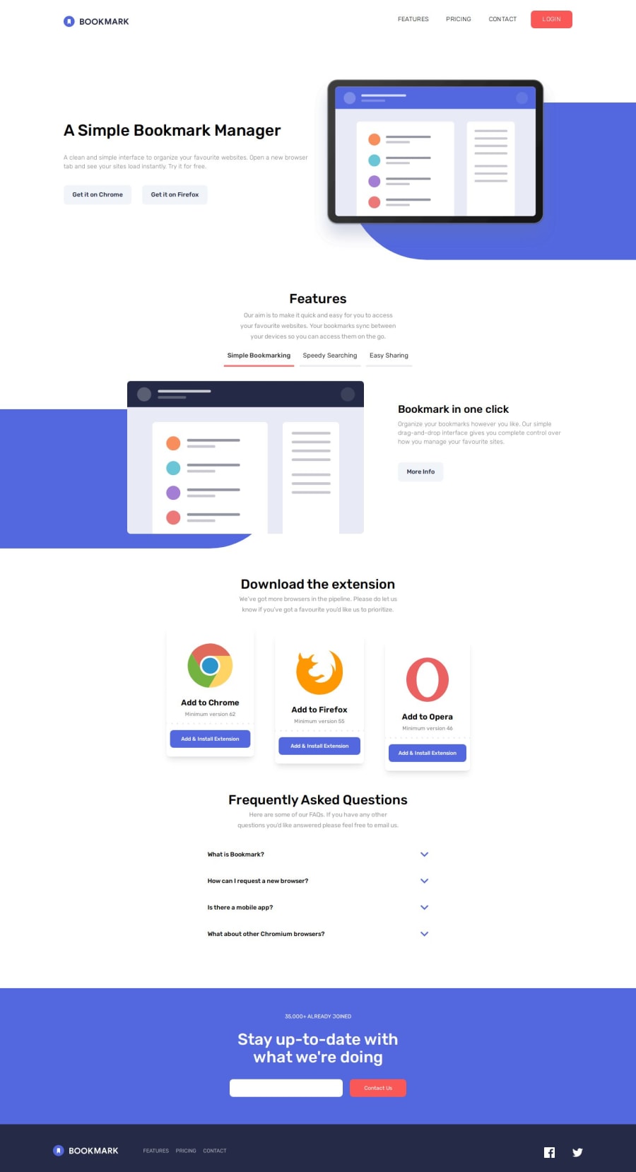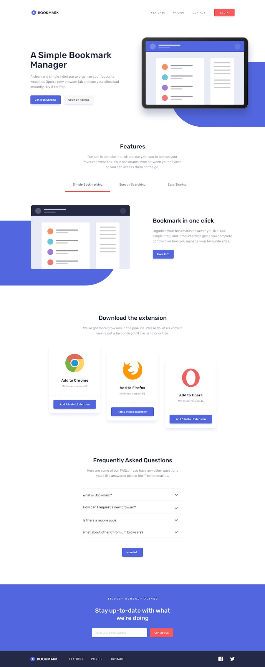
Design comparison
Solution retrospective
I wasn't that excited about using Tailwind but I'm so glad I did. It's a clean, efficient and sometimes fun way to write code. It makes container sizes so easy.
What challenges did you encounter, and how did you overcome them?Getting animations right was challenging but I like a few that I came up with, like the FAQ dropdown.
What specific areas of your project would you like help with?Any feedback is welcome to improve my skills.
Community feedback
- P@aouintihouariPosted 6 months ago
Good job, but there are some room for improvements, For example, on mobile screen size, the text overlaps in the feature section, the email validation isn't implemented, some button background and border colors don't correspond to the the design you were asked to implement, and the hamburger navbar needs to cover everything, including the logo. But it is a good job. My comment is not meant to discourage you, but to push forward and make you take more things into consideration next time.
Marked as helpful0 - P@35degreesPosted 6 months ago
I appreciate the feedback! Your detailed review is helpful to my development, I will look into these issues.
0
Please log in to post a comment
Log in with GitHubJoin our Discord community
Join thousands of Frontend Mentor community members taking the challenges, sharing resources, helping each other, and chatting about all things front-end!
Join our Discord
