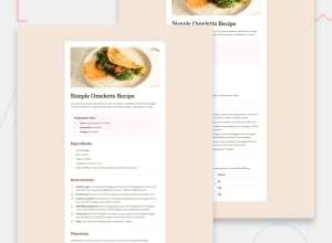
Tailwind, responsive design using tailwind
Design comparison
Community feedback
- @SultanFarrelPosted 7 months ago
First of all, great job on completing the challenge! It takes a lot of dedication to build a web page from scratch, and you've done really well. The overall structure looks solid, and I especially liked how you've made use of Tailwind CSS for styling. The layout is clean, and the use of fonts and spacing gives it a polished look.
That being said, I have a few suggestions that could help push the project even closer to the original design:
-
Image Responsiveness: While the omelette image looks great, it could benefit from being fully responsive. Right now, the height is fixed at h-80, which may not adapt well to different screen sizes. Using responsive height utilities like h-auto or experimenting with aspect ratio utilities could make the image more adaptable across devices.
-
Typography: I noticed the font sizes and weights are a bit off compared to the original design. You can fine-tune these by checking the exact sizes and weights used in the design and applying them consistently. For example, the recipe title could be larger or more prominent to better capture attention.
-
Spacing & Alignment: Some sections (like the headers and paragraphs) could use a bit more breathing room. Pay attention to the margins and padding around text elements. Tailwind offers excellent tools like space-y, mt, and mb to help with that.
-
Color Adjustments: The pink background in the preparation time section is a nice touch, but it feels slightly different from the intended design. You might want to tweak the color or its intensity to match the exact tones in the original design. Similarly, adjusting the shades of gray used in the nutrition table could bring it closer to the expected result.
-
Accessibility: Lastly, considering adding alt text for the image and making sure the contrast ratios for text against background colors meet accessibility standards. This is a small change that can make a big difference, especially for users with visual impairments.
All in all, you're on the right track! With a few tweaks here and there, you’ll get even closer to the final design. Keep up the great work – I’m excited to see how you continue improving this project!
0 -
Please log in to post a comment
Log in with GitHubJoin our Discord community
Join thousands of Frontend Mentor community members taking the challenges, sharing resources, helping each other, and chatting about all things front-end!
Join our Discord
