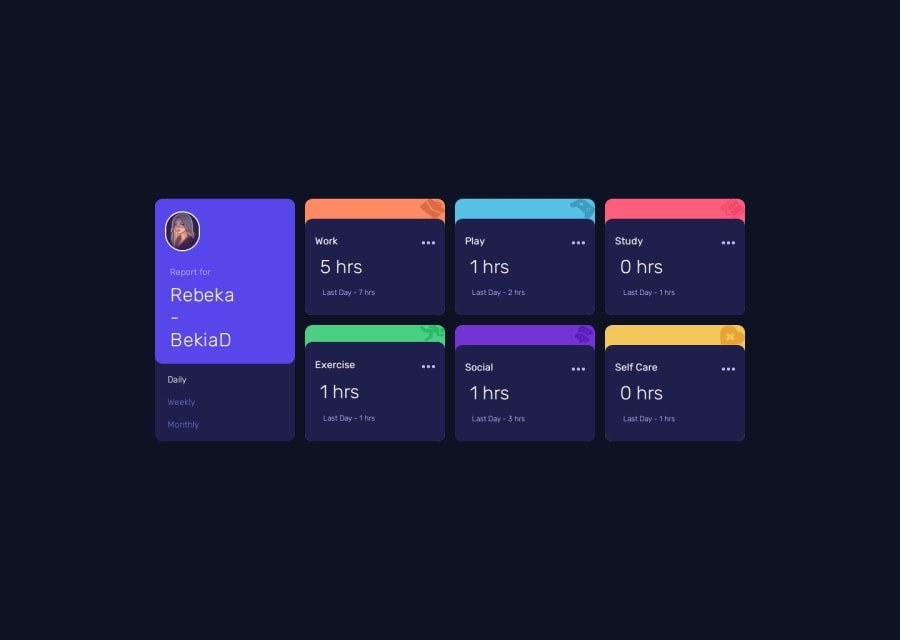
Design comparison
SolutionDesign
Solution retrospective
What are you most proud of, and what would you do differently next time?
The layout and the animations. Little details like hover states.
What challenges did you encounter, and how did you overcome them?The refactoring of the JS into for loops was a bit mind boggling. I find it difficult to think through the process so I use mindmaps for this. Deploying the tailwind project to netlify also took quite some time to figure out
What specific areas of your project would you like help with?Any feedback is welcome.
- on mobile view the top part of the card is cut off because of the h-screen, but if i change it to sm:h-screen it looks fine on mobile, but not aligned on desktop view
- There is a part commented out in my code that would pop up a share button when hovered over the ellipses (...) at each card. I found here difficult to work with the cards individually with a lot of repetition.
- Also the bigger issue is that after the mouseover event the popup stays there.
Community feedback
Please log in to post a comment
Log in with GitHubJoin our Discord community
Join thousands of Frontend Mentor community members taking the challenges, sharing resources, helping each other, and chatting about all things front-end!
Join our Discord
