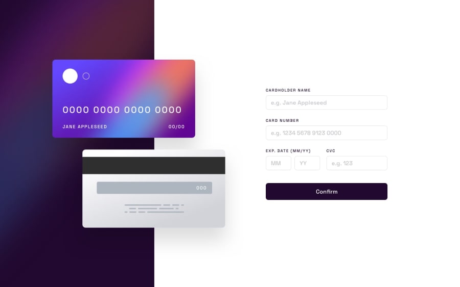
Design comparison
SolutionDesign
Solution retrospective
I used absolute positioning in order to position the card images. not sure if it is the right way.
Community feedback
- @RalfiSlaskPosted about 1 year ago
Hello!
Possible Improvments
Styling
- Maybe remove spellcheck for the inputs.
- Have hover and focus effects on both the inputs and the button.
- Inputs should not be filled in from the start, only have the placeholders.
- Have better spacing between the inputs, button. Tip is to use flexboxs gap!
JS/Functionality
- Add error handeling when the inputs have not been filled in, are strings instead of numbers etc. You can use regular expressions or other ways of checking this.
- The confirm button should handle the functionality, you can for example create a list as a state that keeps track of all the input values in each input.
React
- Organize your code into smaller components instead of having everything in the App component, that way if you want to change the application and add for instance another input you can reuse the input component etc. Then in those component pass down props.
Marked as helpful0
Please log in to post a comment
Log in with GitHubJoin our Discord community
Join thousands of Frontend Mentor community members taking the challenges, sharing resources, helping each other, and chatting about all things front-end!
Join our Discord
