

Design comparison

Community feedback
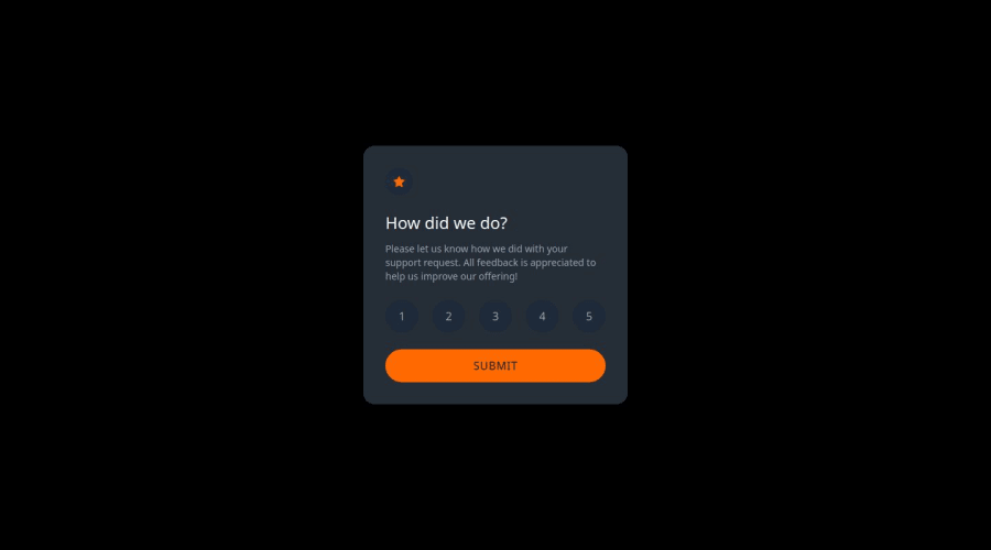
- @codi-AndrePosted 5 days ago
Great solution! They do not provide all the necessary colors in the style-guide to this challenge, but if I could give you tips for improve your solution:
-
Closer elements should be lighter, your buttons have darker backgrounds than the card, this takes away the perception of depth
-
Use more semantic elements, you could achieve the same result using:
<form>,<input type="radio" >instead of only buttons. -
Add styles to the cursor to highlight interactive elements like:
button { cursor: pointer; }-
Try the new hooks from React,
useActionStategave me good help with this challenge. -
The last tip is more an personal opinion, I try to not relay on frameworks too much, one example is the condition to show the thanks card, you could hide it with css, making your solution work in any framework or vanilla javascript, just using:
.thanks-card {
  display: none;
}
0 -

Please log in to post a comment
Log in with GitHubJoin our Discord community
Join thousands of Frontend Mentor community members taking the challenges, sharing resources, helping each other, and chatting about all things front-end!
Join our Discord