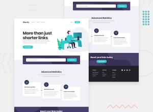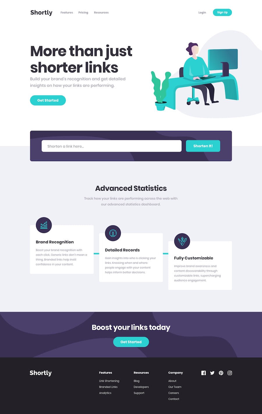
Design comparison
Solution retrospective
It took me a lot of time to make this project as it was my first time using tailwindcss(really!!).
So, any suggestions/tips to improve are highly appreciated!😊
Community feedback
- @pklepaPosted almost 4 years ago
Really well done, mate! I've never user Tailwind before but I thought your mobile menu animation was quite clean.
There are a couple of things that I noticed that if addressed, could make your implementation even better:
-
Your fonts are overall a little small. The Style Guide of the challenge states that the base font-size should be 18px and it really makes a difference to properly take advantage of the provided typography.
-
On a similar note, your max-width for the content is set to 1536px instead of the suggested 1440px from the styleguide. (On my implementation I used 1240px as I found it to be little neater)
-
The way you handled the API errors is super cool and I think I'm going to copy to my own version, but you should probably fix the spacing for long messages as it is overlapping with the button on smaller screens.
Great job overall! Cheers!
1@AniketMJPosted almost 4 years ago@pklepa First of all, THANKS A LOT for taking the effort to point out and list all the things that can be improved
-
Yeah I also noticed that but the thing is I have a monitor with lower resolution and it looks the same as the design but I can't know that it would look the same with monitors having greater resolution. So I tried to use some online resolution preview website that shows how your website will look on different devices and honestly it didn't help at all😅 so I dropped the idea of making it look the same as design on all devices
-
Well I used tailwindcss for that and I thought of using tailwind's 'container' utility class instead of making my own container class with the provided max-width. I think I will change it sooner👍
-
Thanks, It feels gr8 when someone uses my way of handling something😃 And talking about the errors overlapping the button, I honestly don't know the cleaner way of showing the errors, so I positioned those errors absolutely with the input field and when the error pops up, the button would get a little top margin. It was looking OK with the smaller errors but I don't know what to do with the errors that are big. I would be glad to know if you have a better solution for that😅
And if you have taken your time to read all this. YOU ARE A LEGEND HELPING NEW CODERS!!
1@otodavidPosted almost 4 years agoI really love this especially the smooth transitions
One thing I noticed was that the form button covers long error messages on smaller screens just as @pklepa said. Other than that, fantastic work here
1@AniketMJPosted almost 4 years ago@tomi-david Thnx😃😃 And yeah I'll definitely solve that issue!
0 -
Please log in to post a comment
Log in with GitHubJoin our Discord community
Join thousands of Frontend Mentor community members taking the challenges, sharing resources, helping each other, and chatting about all things front-end!
Join our Discord
