Design comparison
SolutionDesign
Solution retrospective
Are there any unnecessary elements? Also code review will be really appreciated
Community feedback
- @Nova988Posted about 3 years ago
Hello,
You forgot some things:
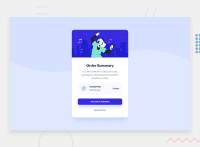
- Background image is not covering the whole background and it is repeating.
- The description text needs to be a different color.
- The 'change' button has a different font-weight and an underline.
- The 'Proceed' button has a box-shadow and a different color.
- You need to change the background of the annual plan container.
- Try to center the card using flexbox.
Hope it helps.
Marked as helpful3 - @CarolineSenesPosted about 3 years ago
Hi Vasilii!
Hi Vasilii!
Here are some tips to improve your solution:
- To prevent your background image from repeating, you can use in your css: "background-repeat: no-repeat;"
- You forgot the top and bottom margins of the card.
- It also lacks the gray background for "Annual Plan". You can put all this part in a div to apply the background.
- The "Change" link is not clickable.
- The interactions on "Proceed" and "Cancel" do not work.
Good continuation !
Marked as helpful1 - @darryncodesPosted about 3 years ago
Hi Vasilli,
Nice work, a decent job all round!
- try adding
background-size: 100% auto;background-color: hsl(225, 100%, 94%);to your body to fix some of the feedback already provided - it'd really help to get closer to the design. - you could clear up your accessibility report if you added a
<main>tag, added some alt -text to your images and don't skip heading levels. Semantic html and heading structure are really important fundamentals
All the best!
0 - try adding
Please log in to post a comment
Log in with GitHubJoin our Discord community
Join thousands of Frontend Mentor community members taking the challenges, sharing resources, helping each other, and chatting about all things front-end!
Join our Discord

