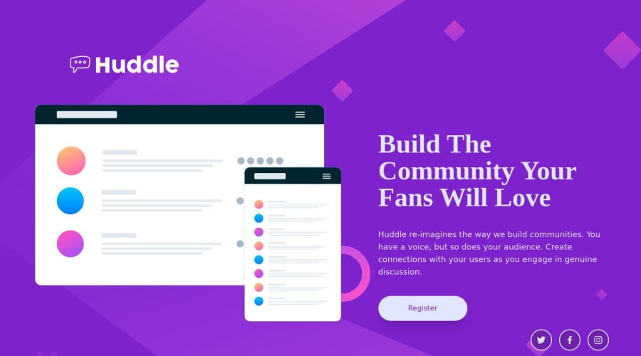
Design comparison
Solution retrospective
sometimes it's to use tailwind for the basic element manipulation and css for making your page responsive since it's super easy to use media query.
Community feedback
- @EgorVadikPosted over 1 year ago
Looks good however, its better if u use the builtin sm, md, lg etc.. tailwind utility classes its easier and will be more consistent than just applying 1 for mobile and rest counting them as desktop, capping the mobile at 375px will lead to errors for other phones. For example my phone is about 412px so it doesn't work on it.
1@Ali-Ghasemi-TechPosted over 1 year ago@EgorVadik thank you for the feed back, i would make the design for laptop first because the toggle device toolbar in google has some sizing issues and makes it hard to adjust my designs, instead of using the builtin tools from tailwind i would add my own media query class so it would be originally designed for a larger screen. for the problem that you addressed i can change my modified class to have "max-width : 425px" so the mobile design would match all phones and also work with desktops but since the design.txt said to set 375px for mobile i went with that. but it make sense to make it slightly bigger for bigger phones. that is how i understood your feed back now if you meant something else feel free to let me know so i can design faster and better with this tool. again thank you for the feed back.
0
Please log in to post a comment
Log in with GitHubJoin our Discord community
Join thousands of Frontend Mentor community members taking the challenges, sharing resources, helping each other, and chatting about all things front-end!
Join our Discord
