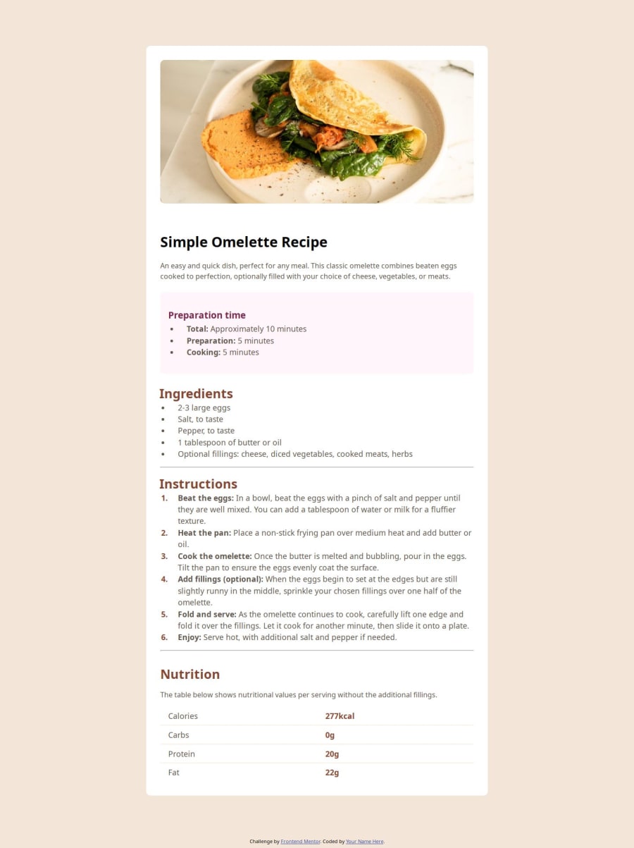
Design comparison
Solution retrospective
i did this all on my own. I spent almost a week on this (got little homesick). I still need to learn padding and margin.
What challenges did you encounter, and how did you overcome them?my biggest challenge was when i made the screen smaller in width, i couldnt make the width on the image 100%. there is still open space in the website for mobile users.
What specific areas of your project would you like help with?This website was a quite challenge! i need to know was my html and css optimazed? I got multiple problems with margins and padding in the recipe-box. some of the text went outside of the box. When you make the width of the screen smaller, how can i make sure that the recipe-box takes full width and height in the webiste
Community feedback
- @StroudyPosted about 2 months ago
Exceptional work! You’re showing great skill here. I’ve got a couple of minor suggestions that could make this stand out even more…
-
Using a
<main>
tag inside the<body>
of your HTML is a best practice because it clearly identifies the main content of your page. This helps with accessibility and improves how search engines understand your content. -
These
<span>
should really have semantic tags like headings (<h1> to <h6>
) and paragraphs (<p>
) convey structure and meaning to content, improving accessibility, SEO, and readability by helping search engines and screen readers interpret the content.
<span>Preparation time</span>
-
If you new i would avoid using
em
units at the moment and just stick torem
, This is becauseem
scales with its parent and can quick get out of control the more deeper you go into nesting elements. -
Line height is usually unitless to scale proportionally with the font size, keeping text readable across different devices. Best practice is to use a unitless value like
1.5
for flexibility. Avoid using fixed units likepx
or%
, as they don't adapt well to changes in font size or layout. -
I think you can benefit from using a naming convention like BEM (Block, Element, Modifier) is beneficial because it makes your CSS more organized, readable, and easier to maintain. BEM helps you clearly understand the purpose of each class, avoid naming conflicts, and create reusable components, leading to a more scalable codebase. For more details BEM,
-
For future project, You could download and host your own fonts using
@font-face
improves website performance by reducing external requests, provides more control over font usage, ensures consistency across browsers, enhances offline availability, and avoids potential issues if third-party font services become unavailable. Place to get .woff2 fonts
I hope you’re finding this guidance useful! Keep refining your skills and tackling new challenges with confidence. You’re making great progress—stay motivated and keep coding with enthusiasm! 💻
Marked as helpful1@ramiadiPosted about 2 months ago@Stroudy thank you so much for the feedback! I'll start to learn BEM. Thank you for your suggestions.
@ramiadi :)
1@StroudyPosted about 2 months agoHey @ramiadi, No problem at all, You got this bro!
0 -
Please log in to post a comment
Log in with GitHubJoin our Discord community
Join thousands of Frontend Mentor community members taking the challenges, sharing resources, helping each other, and chatting about all things front-end!
Join our Discord