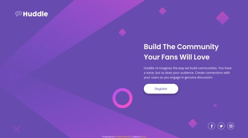
Design comparison
Solution retrospective
Disclaimer: The showcase/hero portion might not show up on the screenshot because I animated it to start outside its container. I could just add the animation class after submitting the solution but laziness is a real thing. LOL!
I tried using a different build with this project. I opted to use a monorepo approach and used Gulp for the first time. I played around with SassScript as well to make px-rem conversion easier and a few more. I feel that under the hood, this web app is still a bit scuffed but it's a good start, I guess.
Please let me know if you find any bugs on the SVG animation, ways on how to improve site performance or any feedback, really. Thank you!
Community feedback
- @pikapikamartPosted about 3 years ago
Hey, awesome work on this one. That animation was really nice. Desktop layout looks great and the mobile state as well. Though the mobile breakpoint could be a lot sooner so that the content getting think will be avoided.
Some other suggestions would be :
- Your website-logo
svg
should have atitle
element inside it like :
<svg aria-describedBy="websitelogo" .....> <title id="websitelogo">huddle </title> ...... </svg >
you will need to do it this way when you are adding a description to an
svg
but ifimg
is used, you can just usealt
and it is much easier.- The hero-section-image
svg
is just a vector so usingaria-hidden="true"
on it would be really great or in general, any decorative images should have an extraaria-hidden="true"
attribute. - Those
sr-only
span
that you included, those should be inside thea
tag and not a child ofli
. - Each social media
svg
could be hidden since they are just decoration so usearia-hidden="true"
on them.
Aside from those, great work again on this one.
Marked as helpful0@idesmarPosted about 3 years ago@pikamart, Thank you for the great advices! Accessibility/ARIA is something I haven't really vastly explored on but is starting to. And yes, the sr-only text was totally in the wrong place. Lol! I wouldn't have noticed it if not for the result generated by Frontend Mentor. For now, I'll leave the mistakes I made as it is... So it will haunt me in my dreams and remind me always! Lol
Your feedback was very much appreciated!
1 - Your website-logo
Please log in to post a comment
Log in with GitHubJoin our Discord community
Join thousands of Frontend Mentor community members taking the challenges, sharing resources, helping each other, and chatting about all things front-end!
Join our Discord