sveltekit
Design comparison
Community feedback
- P@35degreesPosted 5 months ago
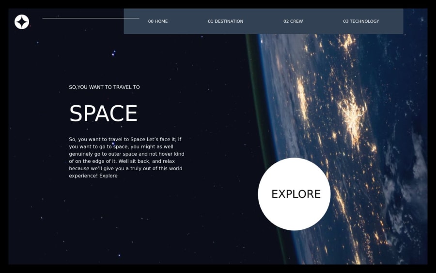
Nice job using Svelte and Tailwind, I think those are the libraries of the future, good to get fluent in them. I noticed the images didn't load on your live site and I have the same issue. What I do is after the first push to Github, I'll go into my Github files and replace the images in my code with the raw image link (like https://github.com/35degrees/space-fem/blob/main/src/lib/assets/home/background-home-tablet.jpg?raw=true) and it works. Annoying extra step but it does the job. You have some mobile size layout overlap when the screen size is too small and the elements overlap, Tailwind has some great resources for that.
0
Please log in to post a comment
Log in with GitHubJoin our Discord community
Join thousands of Frontend Mentor community members taking the challenges, sharing resources, helping each other, and chatting about all things front-end!
Join our Discord
