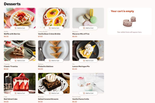
Svelte Tailwind Product cart

Solution retrospective
I made some missteps at the start and some bad component architecture but I was able to do some research and restructure the components. I'm proud that I solved the currency conversion from numbers without installing a library and that I passed props across multiple components including functions. I would do more architecture testing up front instead of jumping in.
What challenges did you encounter, and how did you overcome them?Lots of changes to get the components and props to work together. A good change in one components broke something in another component a couple of times but I worked through these issues.
What specific areas of your project would you like help with?Passing props and using functions as props.
Please log in to post a comment
Log in with GitHubCommunity feedback
No feedback yet. Be the first to give feedback on Sam Hooker's solution.
Join our Discord community
Join thousands of Frontend Mentor community members taking the challenges, sharing resources, helping each other, and chatting about all things front-end!
Join our Discord