Submitted about 2 years ago
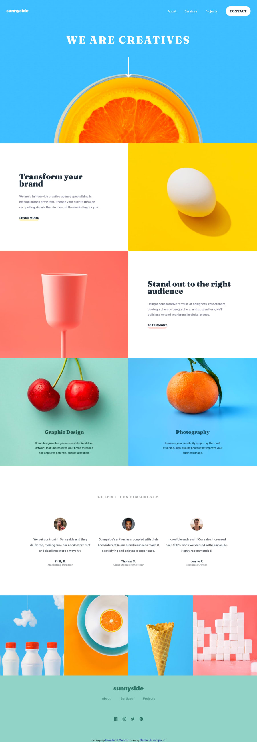
sunny-side-landing-page using cube css and typescript
@DanielArzani
Design comparison
SolutionDesign
Community feedback
- @remtainePosted about 2 years ago
Good job! The design looks really good. The images line up when I'm at 90% zoom, but at normal zoom and others, they tend not to be aligned. I suggest having a container div that takes up all the space you want, then use object-fit to make sure the image always fills the appropriate space regardless of aspect-ratio. Also, while it's not included in the challenge specs, some transition animations would look great as well.
All in all it looks great though! Great job!
Marked as helpful1
Please log in to post a comment
Log in with GitHubJoin our Discord community
Join thousands of Frontend Mentor community members taking the challenges, sharing resources, helping each other, and chatting about all things front-end!
Join our Discord
