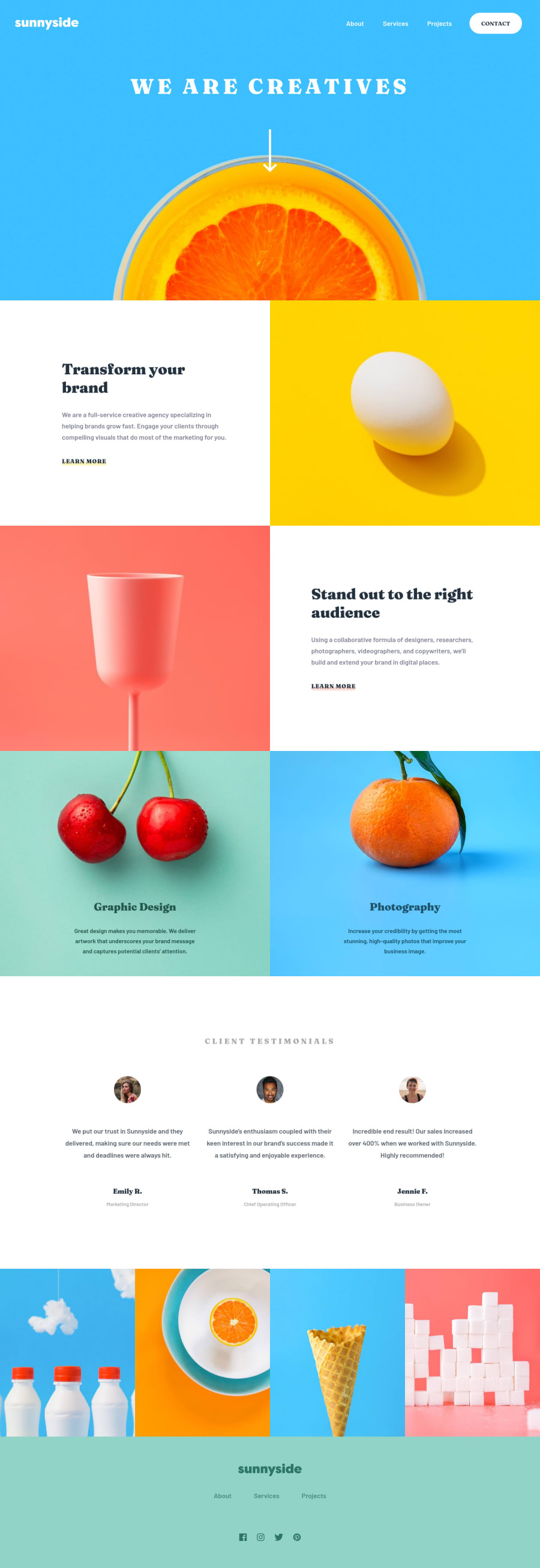
Design comparison
SolutionDesign
Solution retrospective
- The color under learn more. Need ideas. Thanks
Community feedback
- @JoseAngaraPosted over 2 years ago
Hi, I used the
afterpsedo-element for that purpose. This is my code:.text-container__link::after { content: ""; position: absolute; height: 10px; width: 100%; border-radius: 5px; bottom: -2px; left: 0px; z-index: -1; opacity: 0.25; transition: opacity 0.25s ease-in; } .text-container__link:hover::after { opacity: 1; }I put the background color in a modifier.
Marked as helpful1 - @shashreesamuelPosted over 2 years ago
Hey good job completing this challenge
Keep up the good work
Your solution looks great however I think that the title needs to look a big bigger
In terms of accessibility issues simply wrap all your content between main tags
I hope this helps
Cheers Happy coding 👍
1
Please log in to post a comment
Log in with GitHubJoin our Discord community
Join thousands of Frontend Mentor community members taking the challenges, sharing resources, helping each other, and chatting about all things front-end!
Join our Discord
