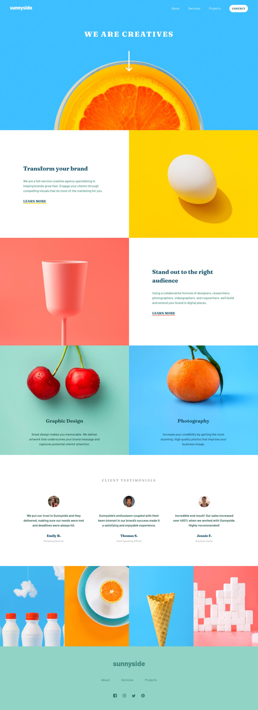
Design comparison
Solution retrospective
The current state of the landing page is not optimized. Some colors may be different and it is not fully responsive to larger screens and screens between 560px ~ 1000px. I may come back to this project to finalize these details, but reaching a fully optimized state for this layout was more challenging than I initially thought given how big the background images become once the screen is resized. Mobile, tablet and laptop screens are preferred while browsing the page.
Community feedback
- @elaineleungPosted about 2 years ago
Hi Rafael, great job putting this together, and I know exactly what you mean about that browser width range because that also gave me quite a headache! Even looking at it again just now made me realize there are a few things I should change. In any case, you can have a look at my solution and see whether that gives you any ideas (even though I still need to clean up my CSS): https://www.frontendmentor.io/solutions/responsive-landing-page-with-cube-css-zJrpzUIQqd
I like what you did with the animation in the mobile nav and button! I think the only thing that is missing is the triangle bit at the top corner, and I'd be interested to see how that would look like when put with the animated nav.
Well done once again!
Marked as helpful1@rafaelrmbPosted about 2 years ago@elaineleung Thank you Elaine for checking it out! In regards to the triangle on the menu, it was personal choice to not use it as I didn't like it very much. I could try to add it later on when I revisit this project.
I had a look at your project and it is perfect! One thing that I could point out is that there's a small bug when you hover over the "learn more" links. The text becomes white, therefore, invisible. It only happens when you're in a specific media query and should be easy to fix! :D
By the way, do you struggle with spacing, colors and sizing while working on your projects without the figma files? Any suggestions on how to tackle that?
1@elaineleungPosted about 2 years ago@rafaelrmb Thanks for letting me know, will get it fixed! Definitely helps to get an extra pair of eyes and I always appreciate it 😊
About working without Figma files, there definitely are challenges, but I think even if I had known the sizing, CSS and HTML is just a completely different way of thinking where it's all relational, and there are different factors that determine a container's width, in that it's not as simple as just setting a fixed placement and size like in design. I see a lot of Pro members who still can't really get the design right even when they have the files. I think the key though is to become really good at writing CSS so that you know exactly what you need to do to make it look the way you want.
One thing that helped me was to adopt the mindset of a designer, such as keeping things simple (even though some designs are anything but that lol) and using 1rem (16px) as a common unit. Most things are based on 1 rem, and it helped me work faster once I started using rems almost exclusively. The biggest challenge I had so far is figuring out an efficient way to work with CSS, but thankfully Kevin Powell has a series recently when he worked on an FEM challenge, and watching him was such a game changer. You can check out his series if you haven't already, and it might help you out!
0
Please log in to post a comment
Log in with GitHubJoin our Discord community
Join thousands of Frontend Mentor community members taking the challenges, sharing resources, helping each other, and chatting about all things front-end!
Join our Discord