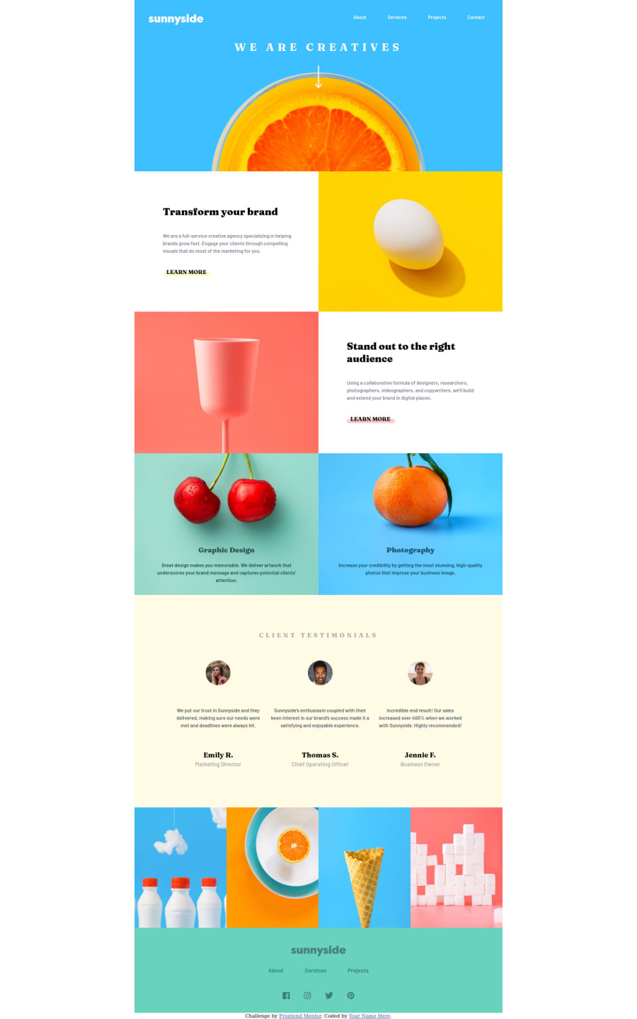
Design comparison
Solution retrospective
I wasn't sure how to display the page for a wide desktop screen without leaving whitespace on the margins. It'd be nice to know if there is a way to preserve the aspect ratio of the images and the proportions of the original design without leaving whitespace on the sides of the page.
I had a hard time organizing the CSS classes I used for this project and I think I created too many of them. In the future, I'd like to have a more clean and organized approach so that my CSS file is not so long and confusing to use.
I wouldn't ask anyone to torture themselves by looking at this page's code but if you have any tips about how to make this page better please let me know.
Community feedback
- @Kamasah-DicksonPosted over 2 years ago
Your solution looks great on mobile devices. I also bumped into similar situation where there was this margin I could not find between images.
You can fix this by
- Displaying IMGs blocks
- Max width 100% on them
Besides great job there👍 Have a nice day and a happy coding👍💻
Marked as helpful0
Please log in to post a comment
Log in with GitHubJoin our Discord community
Join thousands of Frontend Mentor community members taking the challenges, sharing resources, helping each other, and chatting about all things front-end!
Join our Discord
